- September 19, 2022
- Anne-Marie Brunet
Anne-Marie Brunet, CMKBD, CAPS
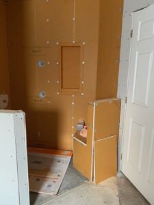
This modern bathroom renovation stalled as the clients were in the beginning stages of their DIY project.
They had started their bathroom renovation project on their own and came to the conclusion they were a little bit in over their heads and needed professional help.
They had already designed the new bathroom layout, purchased their fixtures, fittings and cabinetry, had completed the demo, and construction was in progress.
WHEN A DIY BATHROOM RENOVATION GOES SIDEWAYS
So what’s the problem?
They started the project without having all of the elements selected, confirmed and in place.
They got in a jam when it came time to pull all the different elements together such as tile style, grout colours, and countertop, among other things.
Now, this may seem trivial to some, but their space had several things going on that required careful and thoughtful consideration, plus it was a small space.
They tried selecting the finish materials themselves, but quickly got overwhelmed with all of the different available selections. They enlisted help from their local supply store, but were still not convinced or excited by what was offered. They knew what they didn’t like when presented with it, but they didn’t know how to get to the ‘OH-MY-GOD-I-LOVE-IT’ stage.
That’s when I got the call …during the COVID pandemic, because wasn’t everyone renovating their homes while they were stuck working from home? haha..
During lockdown, they sent me their plans, photos of the ‘in construction’ phase, and a photo of a tile combination that the local supply store put together for them. Through email and phone conversations, we discussed what it was about the materials and the combination they were having a hard time pulling together.
While the clients could not verbally express their vision of how they wanted the bathroom to feel, with more conversations and questioning, they offered up some helpful keywords to describe how they wanted the space to feel. This is important because while there are lots of materials out there, knowing what to look for and how to combine them is the key to a winning transformation.
Her Keywords: Clean, Coordinated, Classy
His Keywords: Clean, Bright, Focused (highlight the pieces)
BATHROOM PLANNING PROCESS
Since I couldn’t visit the home during lockdown, I started by creating the as-built plan of the bathroom based on the dimensions the clients provided. This would help me situate the elements in the bathroom and create a plan for the finish materials. This plan would be the basis for future 3D visuals.
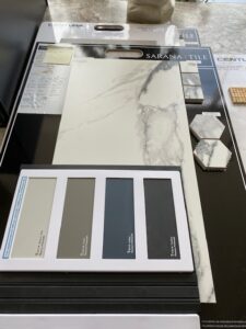
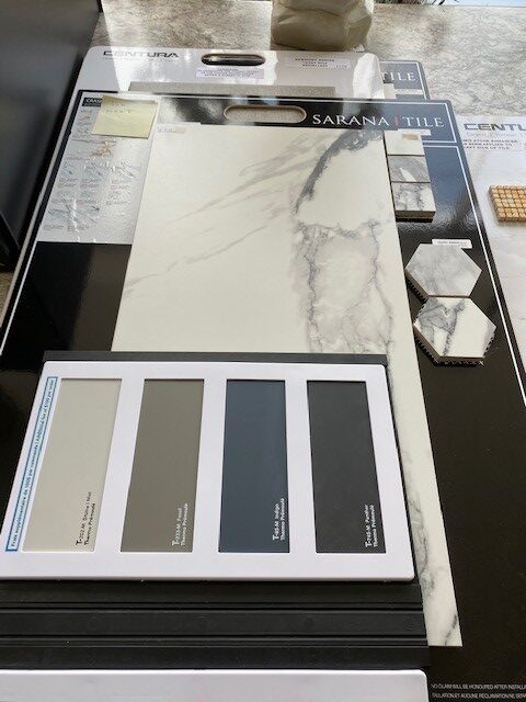
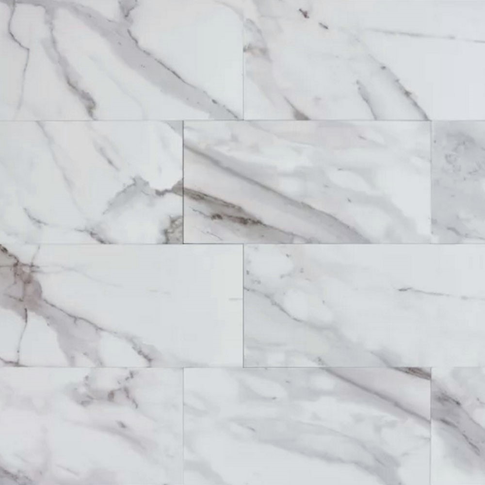
Once the first lockdown was lifted, I was able to do a site visit, and we dove deep into what they were looking for and why they felt unsure about the supply store’s tile combo. Full disclosure – the tile combo was ‘on trend’ – the ubiquitous Calacatta marble look – white with dark grey veining, which was quite popular at the time. (more on that later).
Upon further questioning, the client shared that she is really not comfortable with strong contrast/busy patterns. I could tell by the expression on her face, as she described how that made her feel, how impactful and important it was for her. The Calacatta combo was not going to cut it, for reasons I lay out further down. They also had difficulty envisioning what the space would look like and how it would all come together, not having been offered any 3D renderings or visuals.
While I needed to work with what they’d already purchased, their selections were contemporary, clean-lined, and stylish, and gave me some design style direction.
With the site visit completed and now armed with a lot more information about them, their style, the space, and their wish list, I went to work developing the design, with their keywords for style in mind.
CHOOSING BATHROOM FINISHES – HOW TO PULL IT ALL TOGETHER
Reflecting on the supply store tile combo, I was reminded of her anxiety about busy patterns and high contrast, and that tile combo was anything but calm and quiet.
The tiles were also small – 12” x 24” – yes, that is considered small these days. On the surface and individually on a tile board, those tiles look fine; however, once the entire bathroom is tiled, the high contrast, random pattern would be chaos for her.
HOW TILE AND PATTERN CAN EVOKE CHAOS INSTEAD OF CALM
A few observations about how this tile and pattern lead to ‘visual clutter’ and ‘chaos’;
- The size of the tile would mean a lot more grout lines
- The veining pattern on these small tiles would not match up from one tile to the next
- The high colour contrast in the tile, white to charcoal, would be assaulting to her in this small space
- The busy tile would take away the focus from the striking blue vanity
In a small space, this tile and pattern will feel chaotic, with nowhere for the eye to rest for a reprieve from the veining. Consider how much pattern this creates for a small space. Definitely not the calm, clean feeling they were looking for.
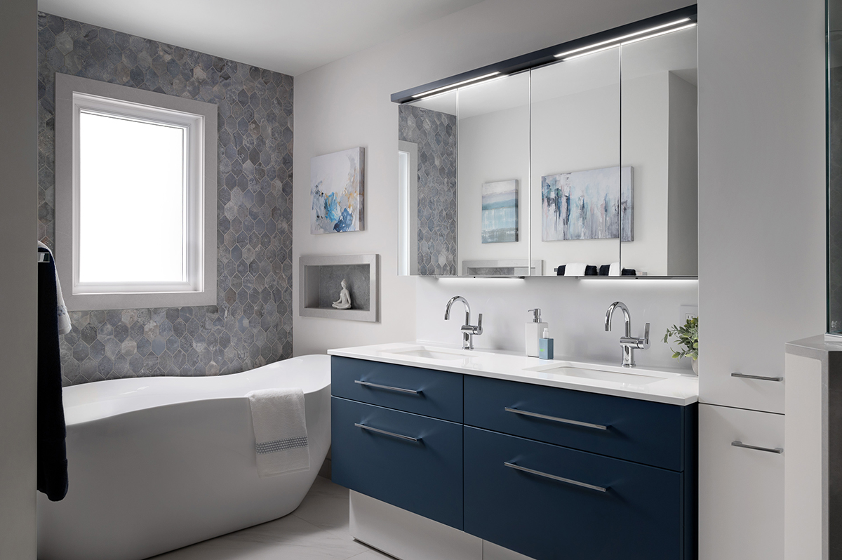
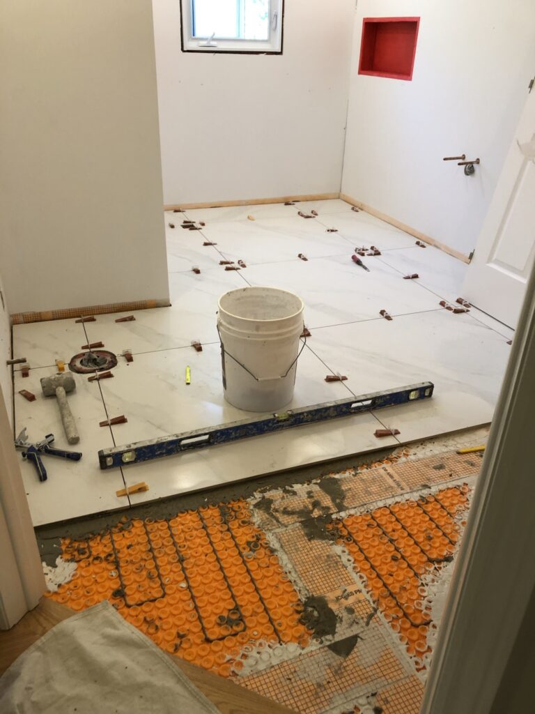
LARGE FORMAT TILE FOR A SMALL BATHROOM
My first selection, one of many, would be the floor tiles, and I had the perfect tile in mind.
I selected a 36” x 36” porcelain tile with a low-contrast, marble stone look. This satisfied the request for classy, clean, and bright.
This tile will remain timeless exactly because of the low contrast.
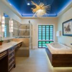
The large-format tile eliminates distracting grout lines throughout, contributing to the CALM feeling on their wish list, and is the right ‘white’ to support the striking blue and white vanity combo.
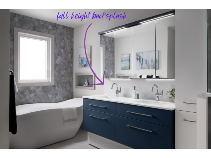
VANITY BACKSPLASH – WHEN BIGGER IS BETTER
The vanity purchase came with a white quartz countertop and a 3″ backsplash.
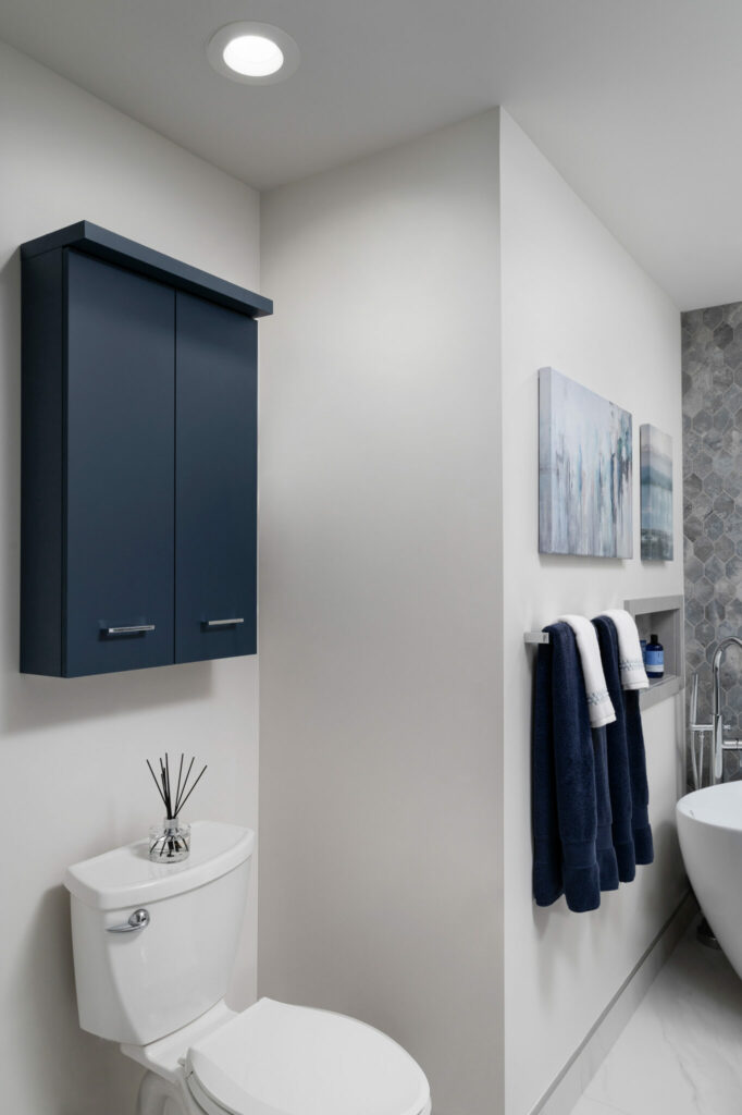
I immediately knew that the short 3″ backsplash would create a distracting visual line between the vanity and mirrored cabinets, and would be difficult to deal with the electrical outlets. Instead, we ordered a new full-height backsplash to eliminate any visual distraction. This small detail contributed once more to a calm, clean look.
HOW TO CREATE A FEATURE WALL IN A SMALL BATHROOM
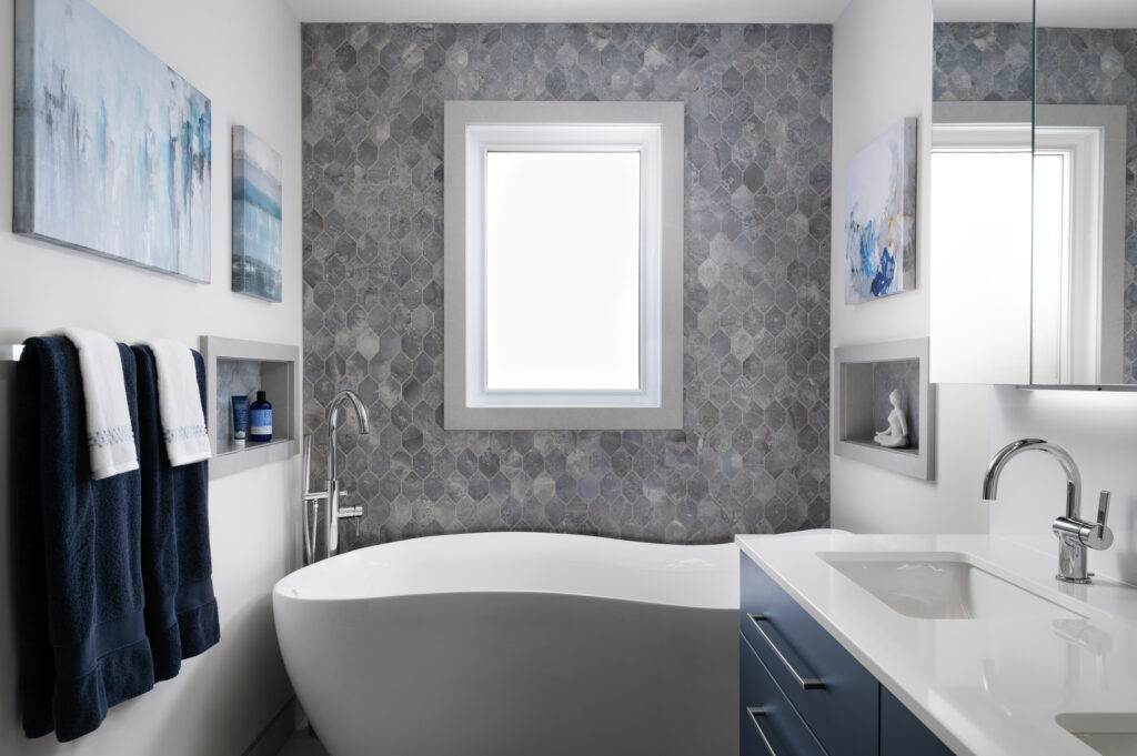
TUB FEATURE WALL and GROUT COLOUR
In my planning, I knew I wanted to highlight the gorgeous tub by creating a feature wall behind it. This would check off his wishlist keyword: ‘highlight the pieces’.
I selected this ethereal blue/grey porcelain tile in two shapes for the tub feature wall and for accents in the shower. It was the perfect ‘in-between’ colour to complement the gorgeous floor and bold vanity. When I think the clients started on their own thinking they needed a ‘same blue tile ‘ as the vanity colour….gasp!
I planned the mosaic rhombus-shaped tile for the feature wall behind the tub. Although this tile adds another pattern to the room, it is very muted in colour, tone, and contrast, which was acceptable to the clients. It also created the wow look they were hoping for.
Sophisticated, effective yet understated.
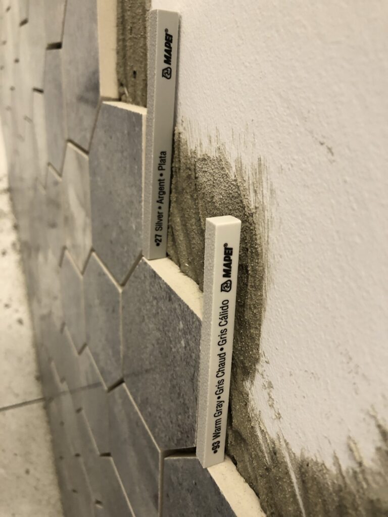
HOW GROUT COLOUR IMPACTS THE LOOK AND FEEL OF TILE
The grout colour played an important role here. A lighter coloured grout would have created the very distracting element I was trying to eliminate. A darker coloured grout would have washed out the shape of the tile, so I needed a grout colour that was the perfect marriage for the tile pattern and shape.
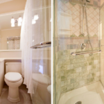
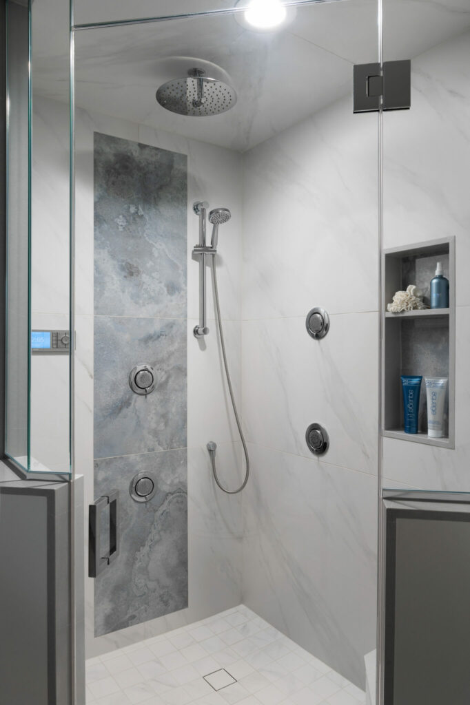
HOW TO COORDINATE DIFFERENT-SIZED TILES IN A CUSTOM SHOWER
SHOWER MATERIALS; WALLS, NICHES & FLOORING
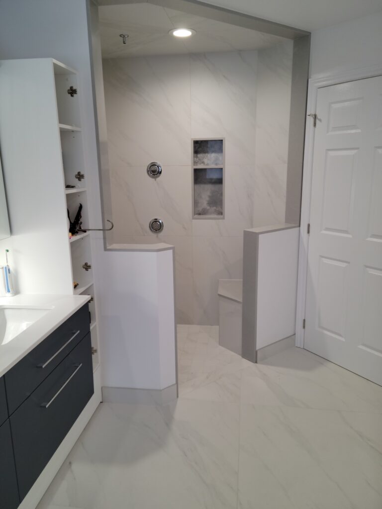
The same large-format floor tile was used for the walls and ceiling in the custom, zero-threshold shower, continuing the coordinated and calm feeling for the bathroom.
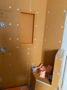
This required a slight reorganization and relocation of their already installed niches and shower fixtures from their original plan. We neede to relocate them so the niches wouldn’t fall in the middle of the grout lines.
To reduce the slip factor for this size of tile, and since the tile was not available in a small format, I had the large-format floor tile laser-cut into 4″ squares. This also helped with the square 4-point drain in the floor. Laser cutting the tile was important to eliminate any edge chipping and to keep all the edges perfectly square for a great fit.
I selected the largest tile available, 18” x 36” (‘cause pandemic supply chain issues.. you know) for the shower accent feature to again minimize distracting grout lines and make a soft statement. Luckily this tile coordinated perfectly with the hex tile for the tub feature wall.
I love how the tile pattern changes from either clouds or a wave, slowly releasing onto the shore.
With proper planning, there was enough of this tile left to use for the back of the niches in both the shower and tub areas – again making a soft statement.
BONUS #1 = In my calculations, I figured we’d have just enough left over to do so for the win! Supply chain issues were very real, and I scrambled to reserve all of the tile until I figured out all of the important details.
BONUS #2 = Using a tile size in a similar size ratio as our main tile, eliminated uneven and additional for easy cleaning – especially in the shower! Remember the main wall tile is 36″ x 36″.
Even though the clients had done their own bathroom layout and did a pretty decent job with the plans, things can change once the finish materials are specified. So it’s always best to have all of your materials selected and planned before starting any major work; otherwise, you might end up having to undo and redo some of your work.
See this bathroom with three different tile sizes and colours
HOW TO TRIM YOUR TILE EDGES AND WHY IT MATTERS
TILES, QUARTZ, SCHLUTER OH MY!
Throughout the planning stage, it became clear that the clients didn’t have enough knowledge or experience to figure out how the different materials, edges, intersections, and transitions would need to be connected and finished to keep everything watertight without creating yet another distraction.
So how do you finish all of these edges, angles, and intersection points, and still keep everything watertight?
I selected and coordinated a soft grey QUARTZ to finish. define, and contain all of the tiles in the bathroom and shower.
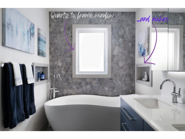
The quartz casings frame the shower entry beautifully and gives it importance.
It creates a frame around the tub and shower niches, as well as the bathroom window, clearly defining them, cleanly finishing, and containing tile installations.
The default for most tile installations would be a metal Schluter tile edge profile, but using a metal Schluter edge would have created a bunch of skinny, shiny, distracting high-contrast lines – reminiscent of a Vegas hotel room in the ‘70’s – which we definitely didn’t want.
HOW TO SELECT THE RIGHT BASEBOARD FOR A BATHROOM?
Using a standard wood baseboard profile would have been yet another distracting element in the room. Instead, I specified that the large-format floor tile be cut to size and be used for the baseboard around the room. This created a clean, sleek profile, further eliminating another distracting element.
I did finish the top of the tile with a brushed chrome metal edge for easy cleaning. The metal edge worked in this application since, when viewed from different angles in the room, it reflects the same colour as the quartz for the perfect combination and minimal distraction.
Still think there’s nothing to selecting materials?
IS YOUR BATHROOM READY FOR A MAKEOVER?
Your home deserves spaces that inspire. Start your own luxury transformation with Sheridan Interiors — where design meets craftsmanship and comfort.
It looks stunning and beyond what we could have expected!
Matt & Francine, Long Sault, Ont.
Serving professionals in Cornwall, Ottawa, and surrounding areas, since 1979!
BOOK A FREE DISCOVERY CALL BELOW
If you’ve been thinking about a new construction or renovation project – large or small – and you’re unsure how to get started, register below for a FREE 30-minute DISCOVERY call to see how we can help you! It’s worth getting advice early so you don’t make a costly mistake.
Select date and time: