A small-ish new construction home receives the royal treatment!
Anne-Marie Brunet, CMKBD, CAPS
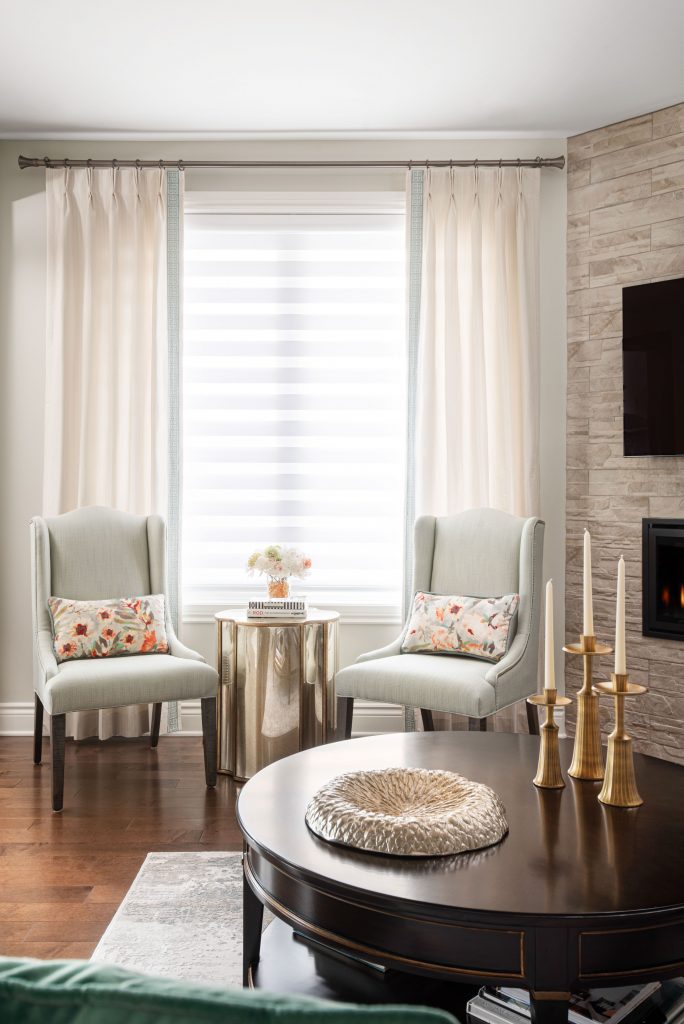
New beginnings are sometimes not always planned, as was the case for this client, however as the saying goes (or at least partially), when a door opens – you might as well walk right in! In an unexpected change of course this client opted to build a new home in the city.
With a dizzying array of decisions to be made, we were selected to help navigate this new construction, create a plan and come up with a design vision to make the new home comfortable and comforting, and a reflection of her personality; petite, graceful, warm and welcoming.
Starting with a blank slate can sometimes be more challenging than doing a renovation with at least some parameters, but it’s also really exciting creating something from nothing!!
Our client was gracious to give us carte blanche, for creativity and furnishings, with the caveat that we find a way to include a few traditional and cherished heirloom pieces into the spaces. And that’s exactly what we did.
So let’s dive in to the BEFORE and AFTER story and how this process unfolded
IN THE BEGINNING
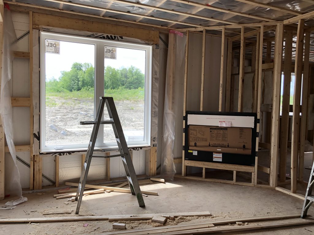
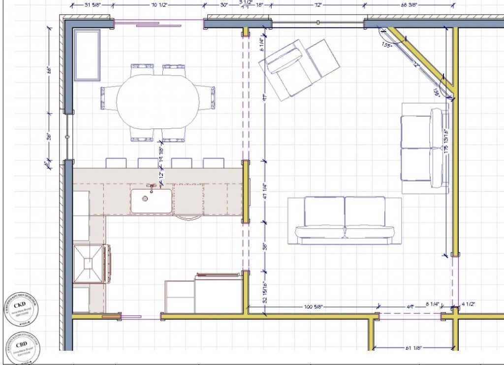
Since the builder would not share the plan with us, I ended up having to measure the whole house once the framing was up to create the as-built in our software, in order to be able to develop the interior design plan.
FURNITURE LAYOUT
Once the shell of the house was in our software, I started developing the furniture layout options for the living room, keeping in mind the pieces that the client wanted to reuse, with a focus of maximizing the spaces and function in the small-ish living room. As I was working through the plan it was clear that ‘off-the-shelf’ sofas would either be too big or too small, and were either too modern or just not the right style.
In order to achieve an elegant and chic look, I specified custom upholstery from my trade vendor and customized all aspects of each piece to fit the space. We got to specify the length and depth of the sofa, the arm style, the leg style and stain colour and all of the fabrics and coordinates.
FIREPLACE
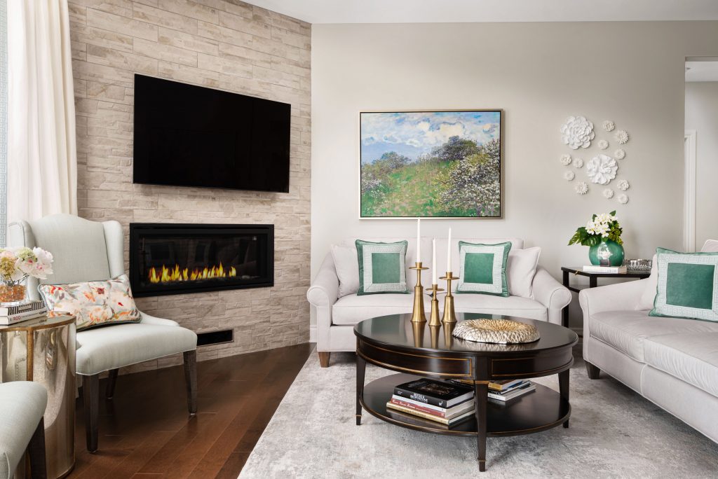
One challenge in the living room plan was the corner fireplace. It’s not really noticeable in the photos but it ate up a lot of floor space, limiting furniture placement possibilities and furniture sizes, but it wasn’t going to change.
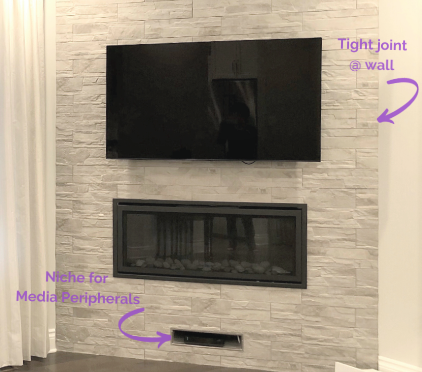
I needed to make provisions for a TV to go above the fireplace itself, since there was no other wall to put it on, and needed to plan on locating the media peripherals and a chase to connect everything together. To accomplish this I added a niche at the bottom of the wall for the peripherals and finished it with the same tile. It’s tucked away and is not the focal point and it works perfectly.
The fireplace is finished with a modern sleek stone in a light colour to keep it from overtaking the room. I had the installer angle the back of edge of each tile to butt into the adjacent walls so that we didn’t have just a straight cut and a small crack at the wall. It was definitely worth the effort.
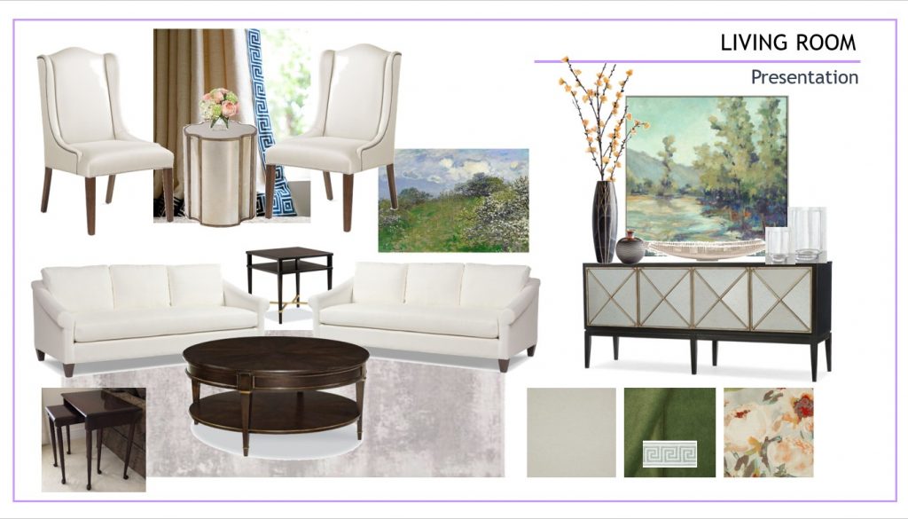
With the main seating area starting to take shape next up was to select and coordinate the colour palette for both the furniture and the paint colours.
COLOUR PALETTE – BEGINNINGS
In selecting the colour palette for the home, the client’s only stipulation was for ‘light and bright’ but otherwise gave us free reign. As I got to know her better I started putting selections together and concluded that this collection and combination suited her perfectly. Bright yet warm, welcoming and chic. (not all fabrics shown)
A combination of ivory, spa blues, coral and green, in prints, solids and textures perfectly complemented the space and the client. The mix of patterns bridged and blurred the line between traditional and contemporary. Mixing traditional and modern furniture in different wood and metal finishes worked great in this small space, and gives it style and character as if it was curated over many years.
AREA RUG
Now that the main upholstery pieces and most fabrics and colours were confirmed I needed to coordinate an area rug for the living room. Now you wouldn’t think that selecting an area rug would be this difficult, however, the room size made it impossible to select a standard size rug.
They were all either too big or too small or patterns not oriented the right way. It had to be just long enough to extend beyond both sofas, yet not trip on it and not run into the angle of the fireplace.
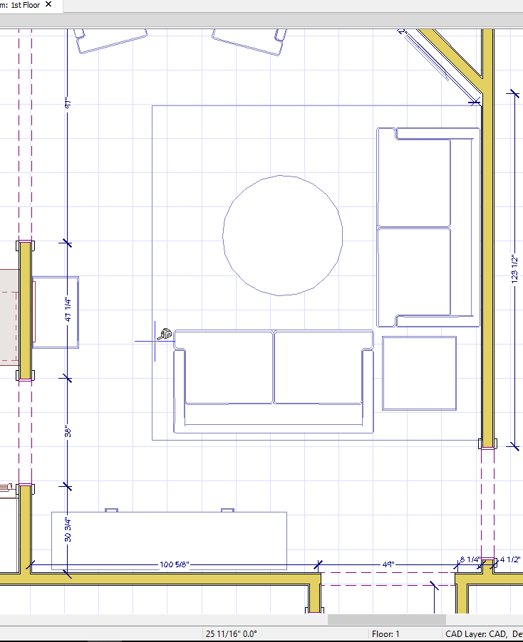
The dimension of the rug made it almost square but not quite – important to note for installation day!
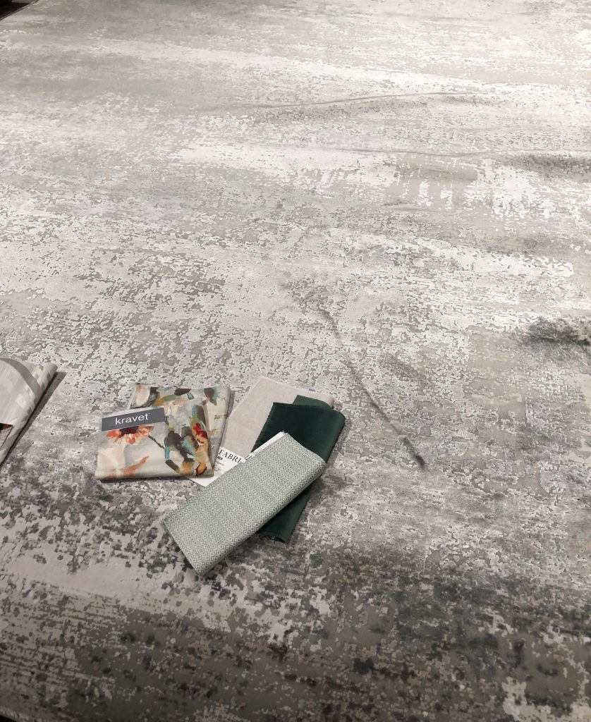
The other thing about the rug was the nap. Depending on which direction the light hit it completely changed the look and colour of the rug. It was almost like having 2 rugs in one. This was also important to note for installation day.
(You don’t want to be handling a rug more than once on installation day with the delivery guys waiting for you to make up your mind).
Once again I turned to my trade only vendor for a custom rug. I loved the look of this one in neutral cream/ivory/gray. It was subtle, abstract and neutral to support the light coloured upholstery, and I was able to have it sized right and fabricated to our specifications.
LIGHTING PLAN
With the furniture layout completed and art and accessories located within the plan, I turned my attention to the lighting plan for the home. The client did not want any large table lamps so I had to make sure there would be adequate lighting located in the right spots, for both task and ambiance. I always include dimmers on all lighting so you get the most use out of one fixture. Bright full light for tasks, and softer ambient lighting for entertaining.
It’s a 2-fer!
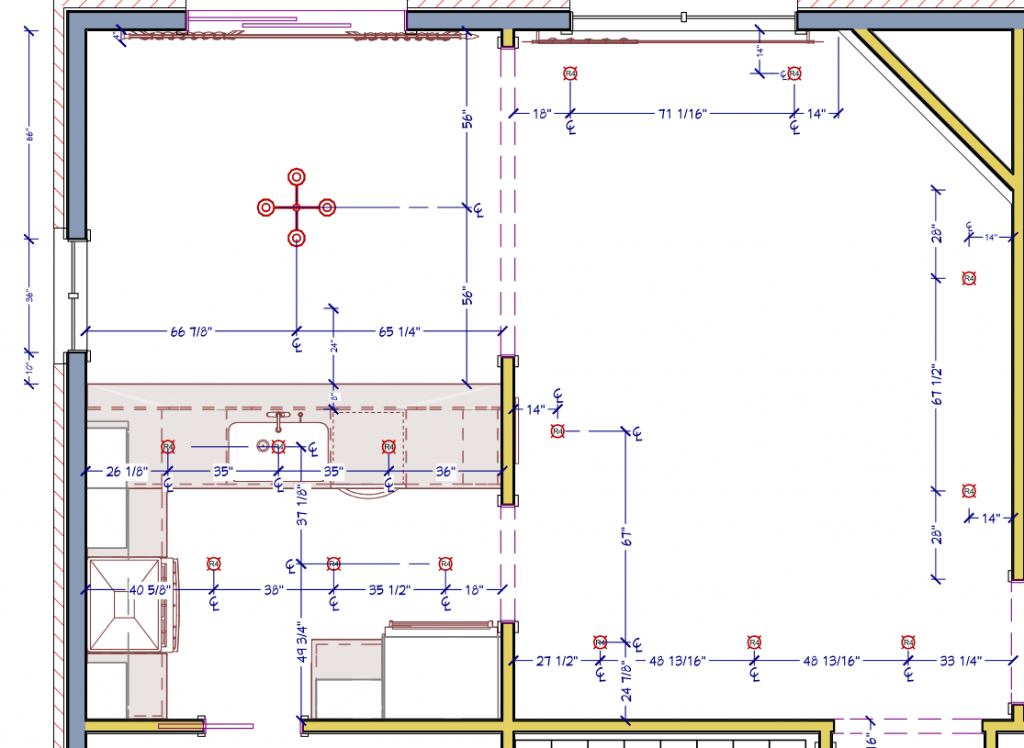
New home construction is notorious for not having a high enough dollar allowance for lighting. You need to invest in lighting people. This is a ‘rip-the-band-aid-off’ kinda decision in terms of costs. You don’t want to have a fully curated, beautifully inspired interior with crappy lighting that makes you and your room look bad. You will not be happy and you will regret it, only to have to change it out or add to it later which will be more expensive and messy.
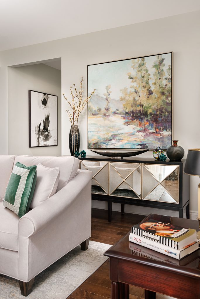
Below are a few snippets of the living room.

KITCHEN
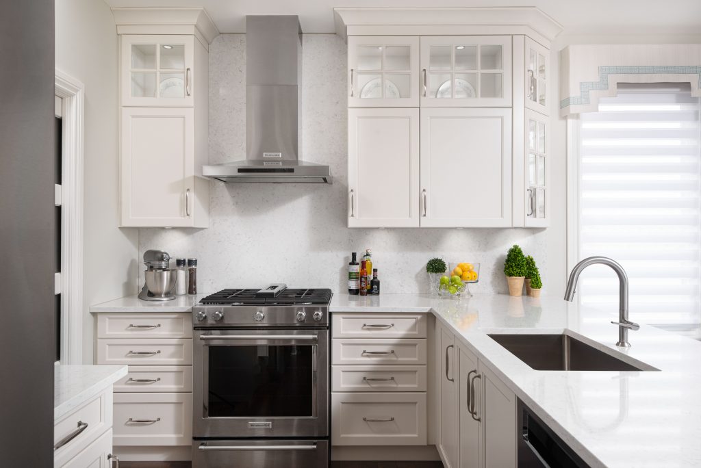
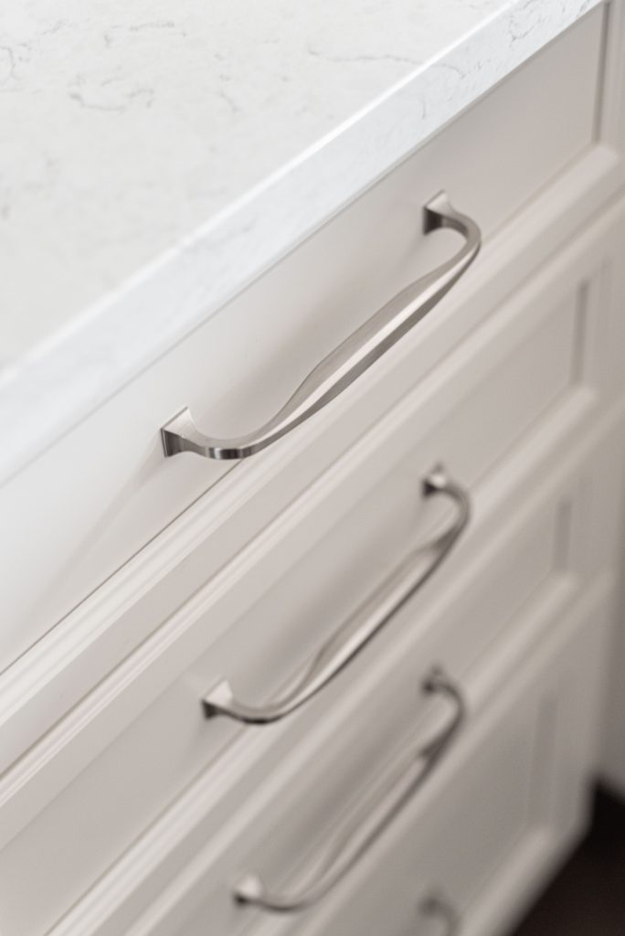
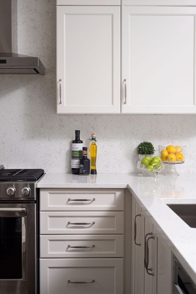
The kitchen layout was tweaked from what the builder offered in the original plan, and I included a lot of cabinet organizational accessories to make this kitchen work as hard as it is pretty. I selected a neutral cream colour, with a slight gray undertone, for the cabinets and complemented it with a slightly brighter quartz countertop. I chose to use the quartz for the backsplash, since it’s a small space, to keep clean lines and limit distractions. Polished nickel hardware gives the kitchen a little touch of ‘glam’.
There’s actually a large pantry in this small kitchen and stores all of the extra appliances and chachkies that you don’t use on a daily basis. The microwave is in there too, on a dedicated shelf, since it’s not used daily. Realistically it would have been difficult to locate it in the kitchen and keep the kitchen as airy as it is, since it’s a small space too. Small and mighty though ?
FOYER
You’d think that I would start at the entrance when working up a design plan right? Nope.
I most always start with the great room (big or small) and develop the design and style there first. That will then inform the design direction for the rest of the home.
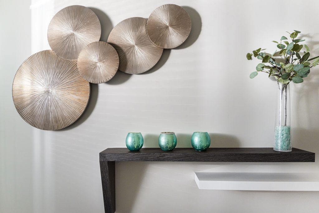
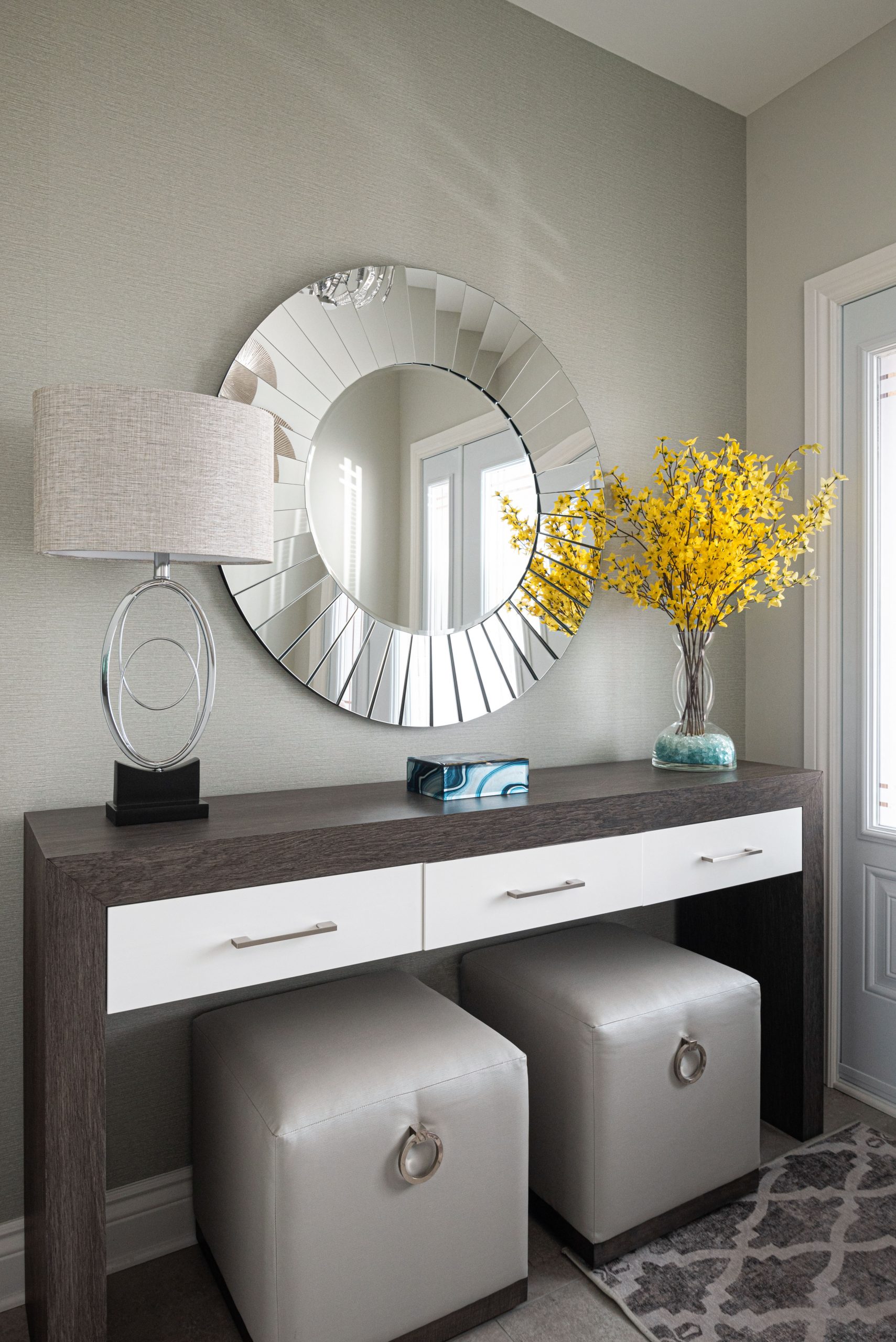
This foyer is actually not a bad size for this small house, and I wanted to ensure that it was as functional as it pretty. The foyer has a long hallway that leads from the front door to the main rooms of the house and that needed to be addressed. It’s not always about putting up lots of pictures…
To make the best use of the space I ended up designing a custom console table to fit the entry, along with shaped floating shelves for the longer wall and had them fabricated by my cabinet company. We wanted something sleek, modern, and functional. I added small ottomans on casters that are easy to pullout and can roll over to the garage entry if needed. Now there’s a place to drop off keys and purse, sit down to put on or take off shoes and boots.
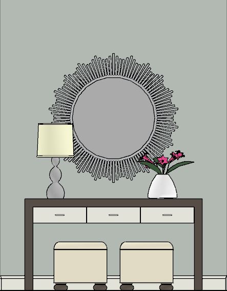
Use the arrows on the photo to see the BEFORE & AFTER of one side of the FOYER.
This is the opposite wall of the foyer – the long hallway wall.
OWNER’S SUITE
This bedroom is sooooo pretty!
I had it in my mind from the beginning of this project that the owner’s suite had to be ALL OF THAT! ….and realistically who doesn’t want a magazine worthy bedroom right?
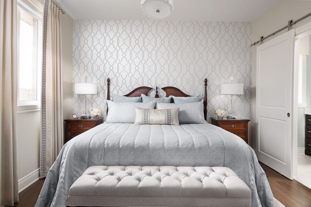
The bedroom set was part of the furniture pieces that the client wanted to re-use in the new home. It is a very traditional style yet the client wanted light and modern. Following the colour palette and keeping it fresh and light, I coordinated this ensemble to elevate this room from regular to wow!
WALLPAPER
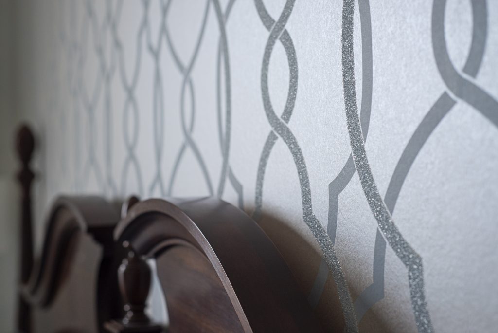
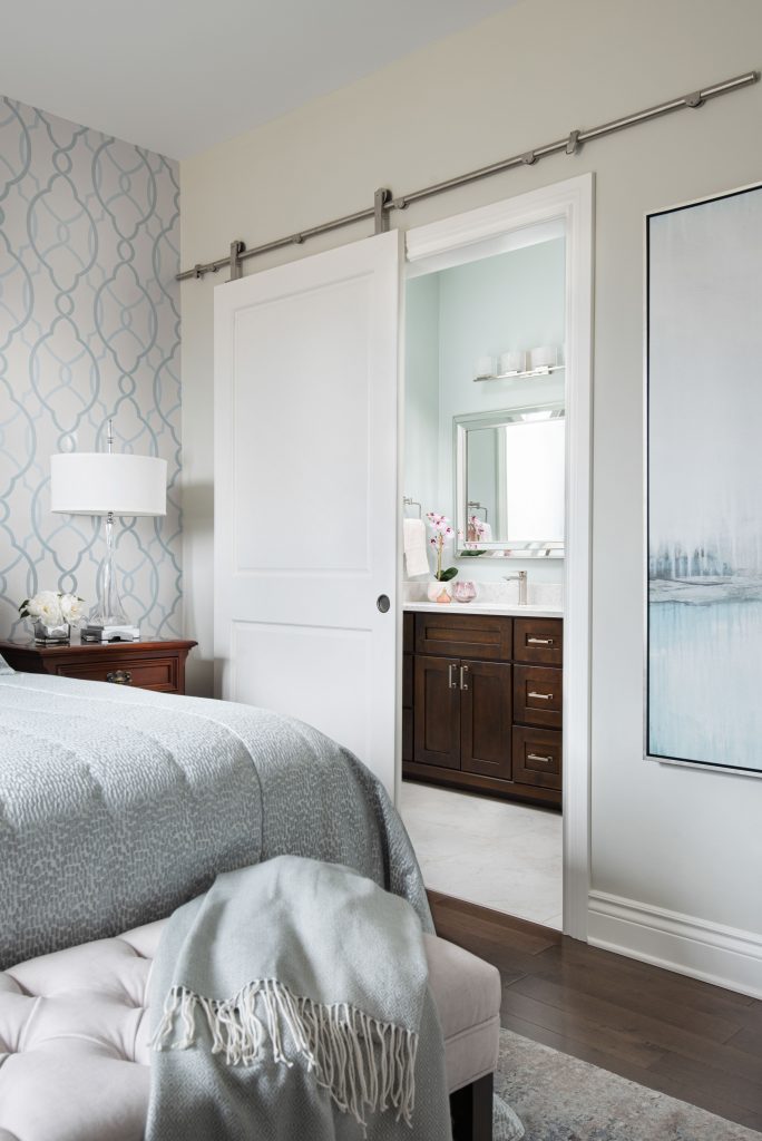
It started with the wallpaper, I mean look at it! It’s encrusted with small crystal (and no they don’t fall off).
A traditional shape yet it feels modern and updated. When I saw it – it was THE ONE!!!….and that was the jumping off point for the rest of the room. Shimmery, glam, refined and chic – yes please!
BEDDING
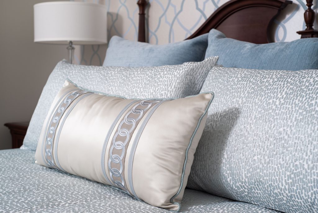
Bed linens and pillows are all custom designed and fabricated by us so that we could get just the right shades of gray/blues. Keeping it monochromatic but adding texture was the key in keeping this bedroom elegant and refined.
AREA RUG
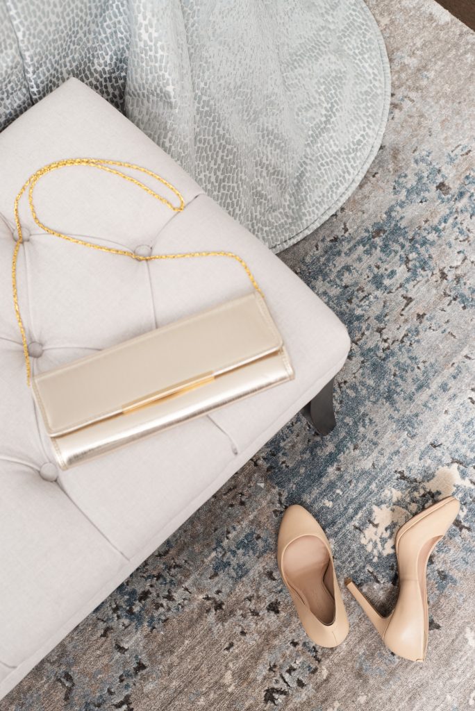
With the main fabric components confirmed the next item to select was the area rug. As soon as I saw the small sample of this rug I knew it ‘was the one’…then I ran my hand over it..and well..…*swoon*!! A mixture of silk and wool was the perfect blend. Wool for stability and durability and a bit of silk for some shimmer and softness. The contemporary abstract pattern, with a mixture of the right colours and shades, ticked off all the boxes. This rug was also custom sized and fabricated to fit the room.
DRAPERY
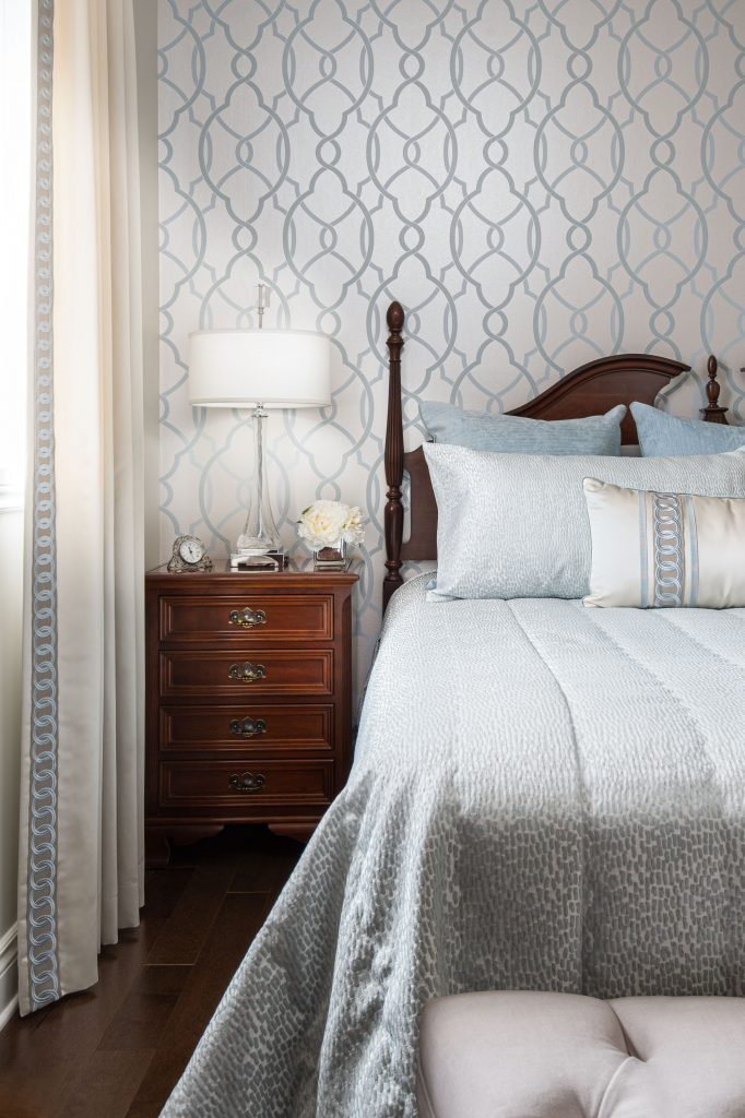
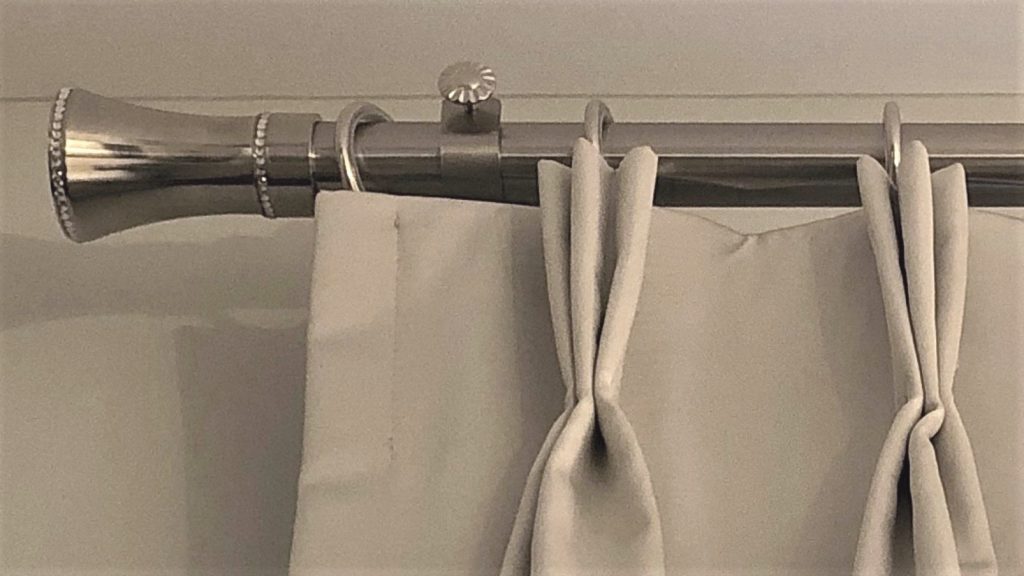
The drapery is a ‘stone’ shade of greige and I added the large tape trim to the edge to give them presence. The tape trim is also used on the bolster pillow. All installed on a brushed nickel rod with small Swarovski Crystals in the finials.
ARTWORK
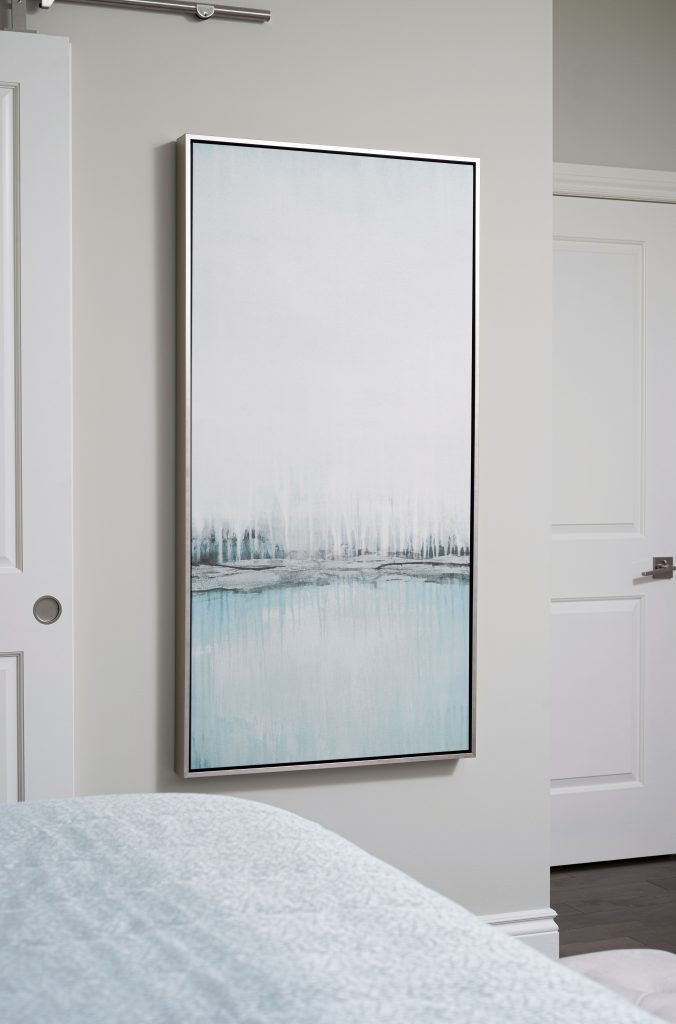
The artwork selected did not look like this at all. It was a different size and a different colour altogether. Once again turning to my preferred trade vendor and was able to have it sized to fit the wall and had them change the colours to suit our space. It was a great process and outcome don’t you think?
ENSUITE
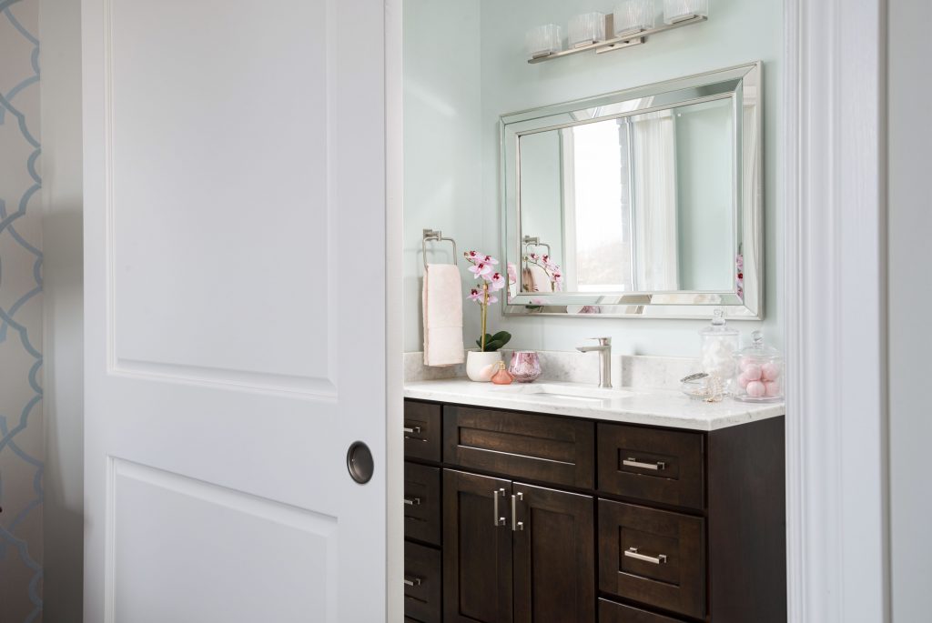
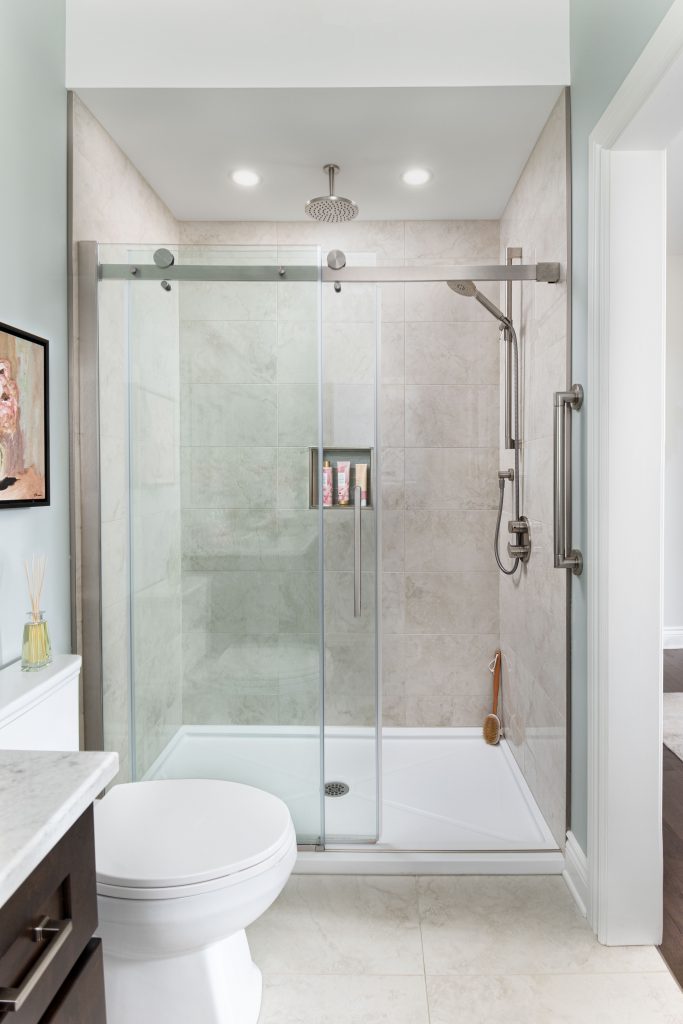
I opted for a dark stain for the vanity so that it relates to the owner’s bedroom set and create a complete ensemble. Keeping the ‘light & bright’ caveat, I paired it with a light quartz countertop and light coloured floor tiles. The floor tiles are large @ 24” x 24” for this small space, but creates a quiet space void of too many distracting grout lines.
A full shower was selected instead of the usual tub/shower combination and it really makes the space look larger than it is with the large glass door. This shower has it all; a rainhead, a sliderail for hand shower and a grab bar all in modern shapes and finish.
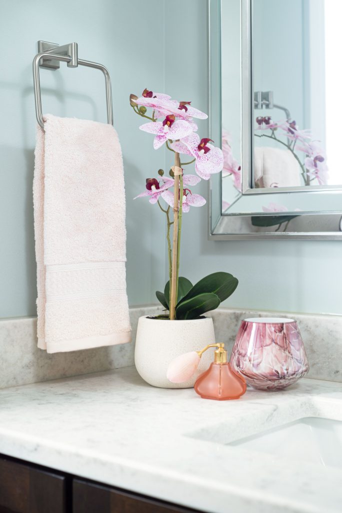
A perfect small original canvas, in a dark-frame, completes this petite ensuite.
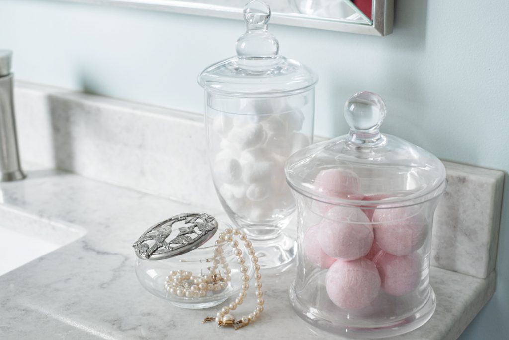
A delicate touch with accessories in complimentary pinks and mauves give this space some energy and
feminine flair.
Thank you for reading to the end. Here’s a cute puppy for your troubles :)!

GOT QUESTIONS?
If you’ve been thinking about a new construction or renovation project – large or small – and you’re unsure how to go get started, register below for a FREE 20-minute DISCOVERY call to see how we can help you!
Select date and time:



Carol
| 6 January 2022Highly recommend Anne-Marie for large or small projects. Her support, kindness and expertise helped the process go from stressful to stress-free AND enjoyable!!