I’m not one to jump…
on the ‘Colour of the Year’ bandwagon (usually) but this year’s selection by Pantone
just brings a smile to my face.
After 2 years of….well you know what!…this colour is just HAPPY!
..and couldn’t we all use a bit of HAPPY at this point?
It’s fresh, bright, invigorating, uplifting and I promise you will fit in with just about any design style out there. Read on to see how to use this fantastic and often under-estimated colour.
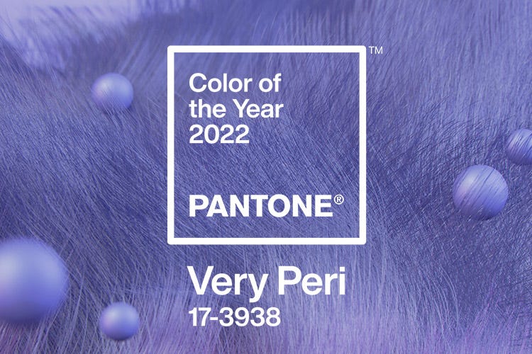
It’s a cross between Periwinkle, Purple, Lavender all mixed into one new colour.
As with every new ‘Colour of the Year’ I like to take it more as a cue and inspiration, and see how and where else it can be applied with all of it’s colour variations.
You can go as bold or as soft as you like with it – so what’s not to like?
♪ ♫ You can do a little or do a lot ♫ ♪
(my variation on JLO’s song)
Here are some examples of how to use this colour for both interior and exterior.
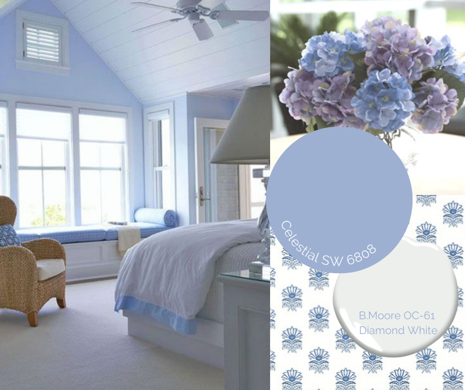
COASTAL BEDROOM
…..fresh, soothing, natural: can you feel the breeze?
Any variation of a blue colour is the perfect colour for a bedroom.
Blue fosters soothing and restful sleep.
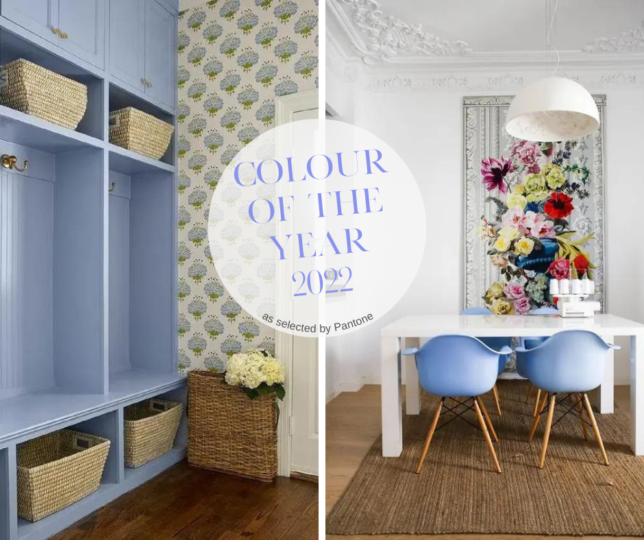
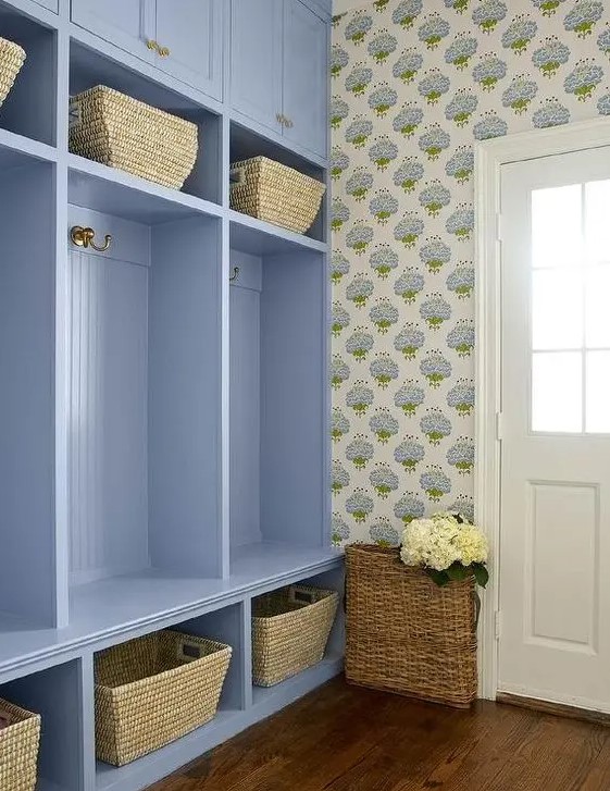
MERRY MUDROOM
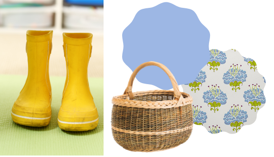
How happy would you be when you walk into this modern country mudroom?
The floral paper reminds me of fluffy sheep when I look real quick.
(is that weird? haha)
COTTAGE ISLAND
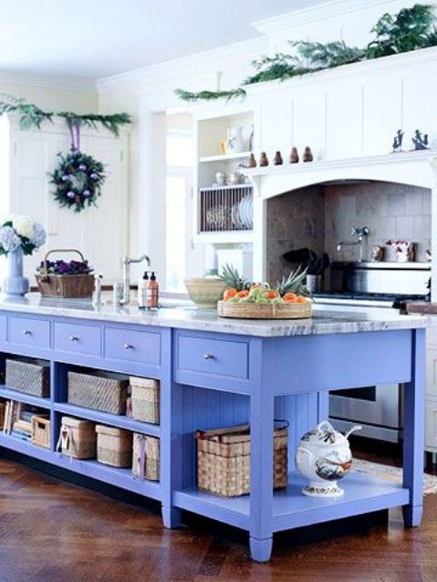
Sometimes you just need a bit of encouragement to step away from the crowd and do your own thing!
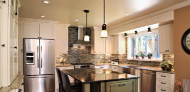
A true Periwinkle Colour…perfect for a summer home or cottage don’t you think?
COLOURED APPLIANCES
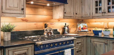
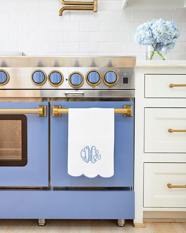
Did you know you can get your appliances custom coloured too?
Yep, DACOR and BLUESTAR are 2 appliance manufacturers who offer selections from a standard colour palette but they will also do any custom colour you need or want.
Now THAT’s how to make your house your own!
MAKE IT MODERN
Modern, Vibrant, Colourful without overpowering.
Here a very traditional rug pattern is mixed with contemporary furnishings and modern art.
You probably already have some elements in your own home that can be
repurposed and updated with minimal expenditure.
If you don’t, then Art is a good place to start.
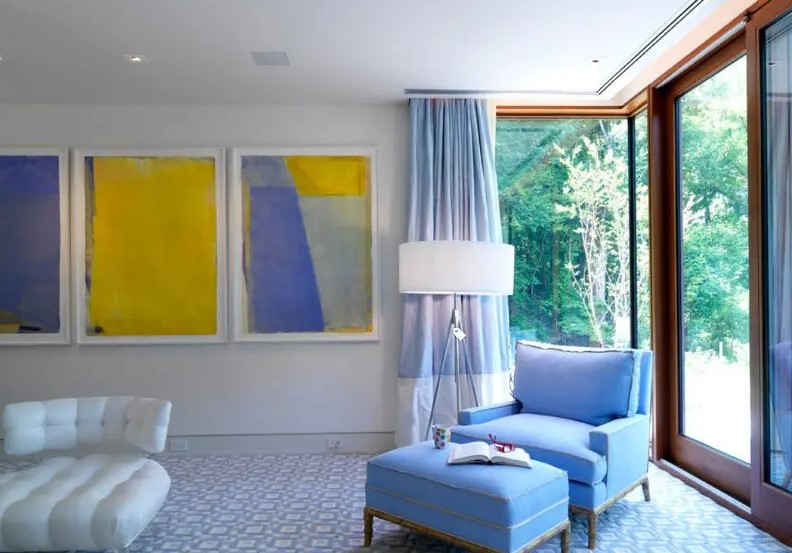
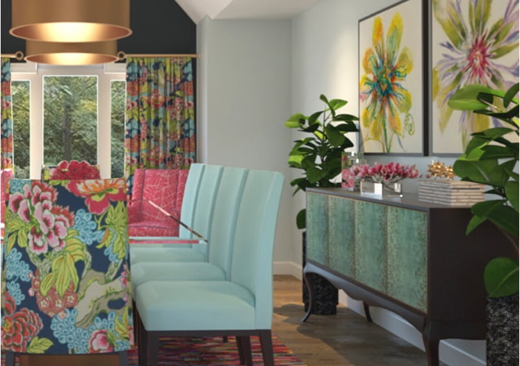
POP ART COLOURS
Start your day off with an eye-opening colour combination.
This will surely wake you up and put you in a good mood!
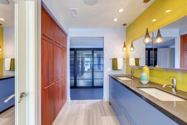
…and now here’s the ‘JUST A LITTLE PART’ for using the
Colour of he Year!
If you can’t, or don’t want, to do an extensive makeover, adding small elements of a new colour can bring your room up to date and give it a quick refresh.
ONE SIMPLE PIECE OF FURNITURE
You can buy new if you need to or re-upholster a piece you already own
and breathe new life into it and give it – and you – a fresh start.
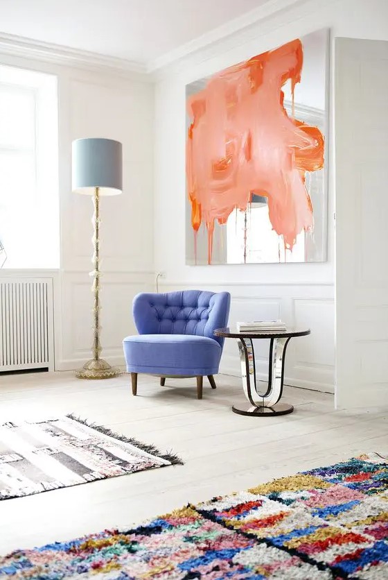
UPCYCLE
If you like the ‘thrill of the hunt’, why not rescue a ‘stray’.
Paint up old or well-used chairs, or table, and give them new life!
You’ll be glad to have something ‘new’, and you’ll help the environment.
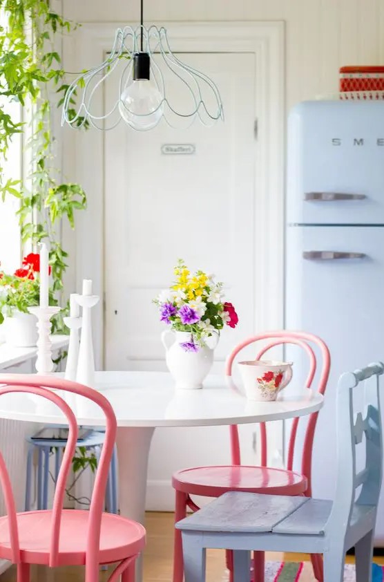
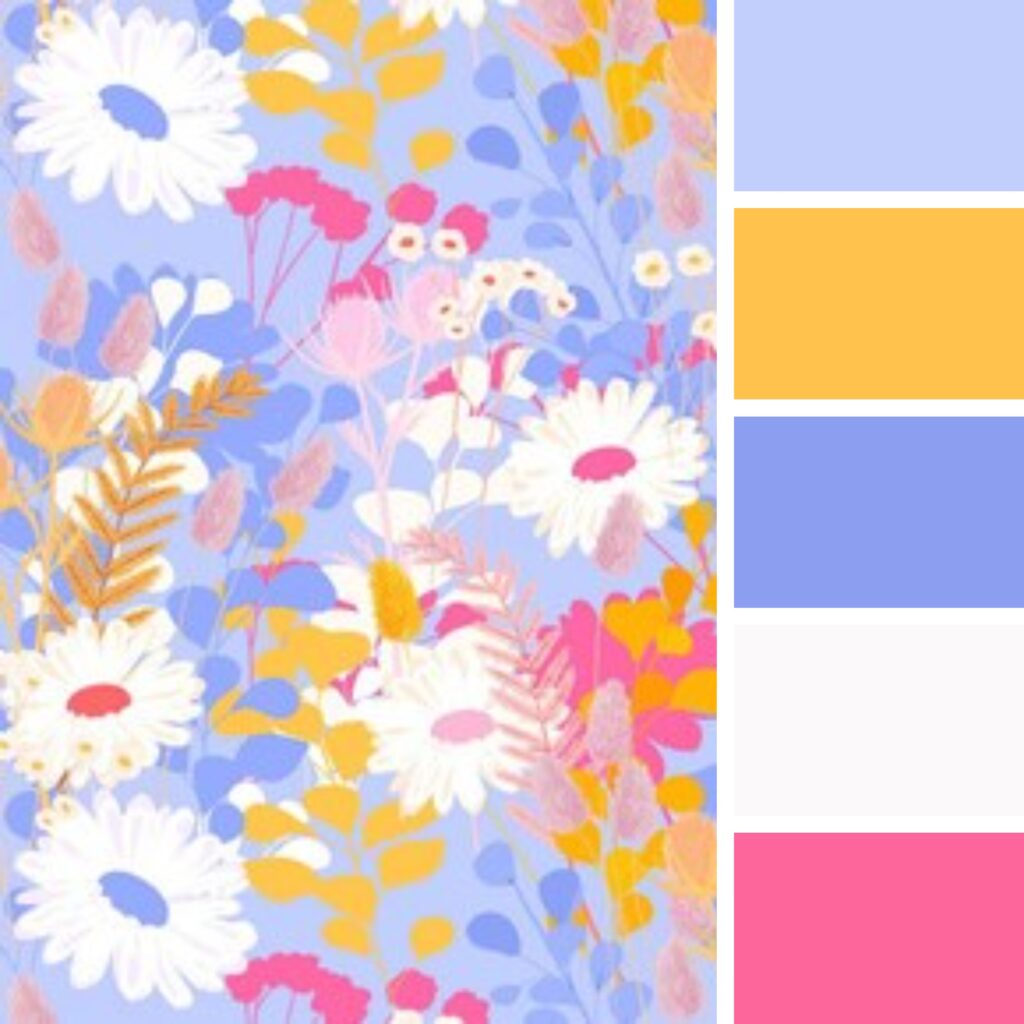
Now how about some COLOUR COMBOS to spark your imagination
Warm & Cool Combo
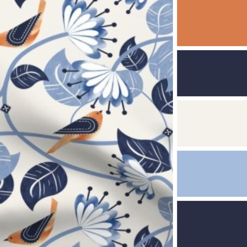
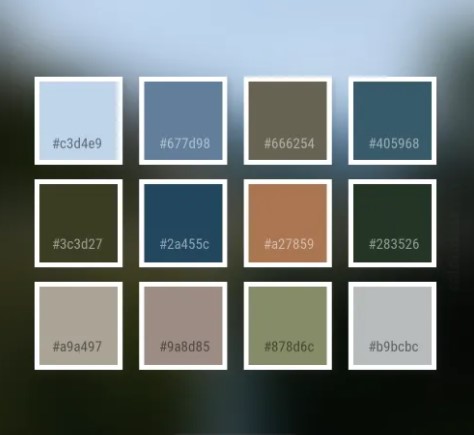
Bright & Cheery
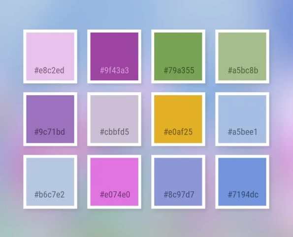
Analogous and Quiet
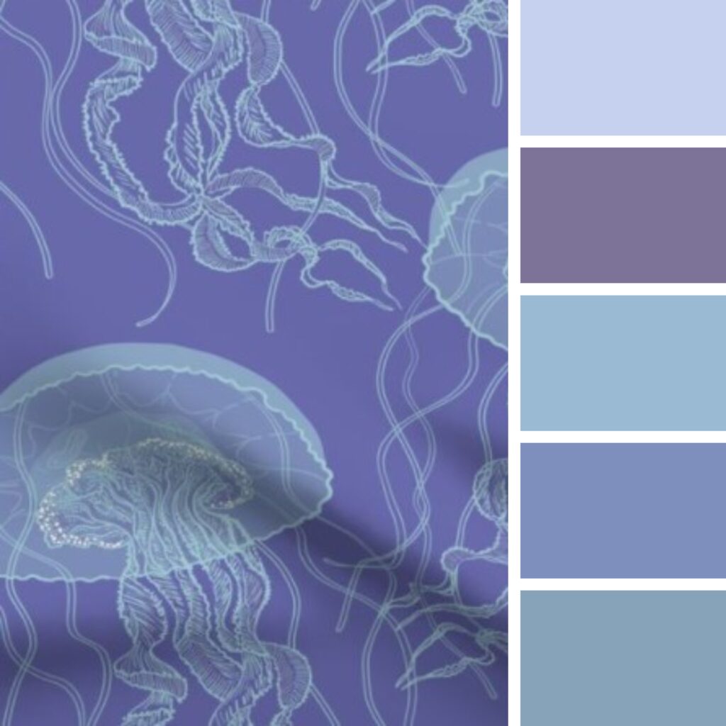
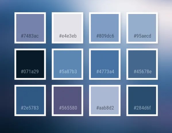
POP ART COMBO
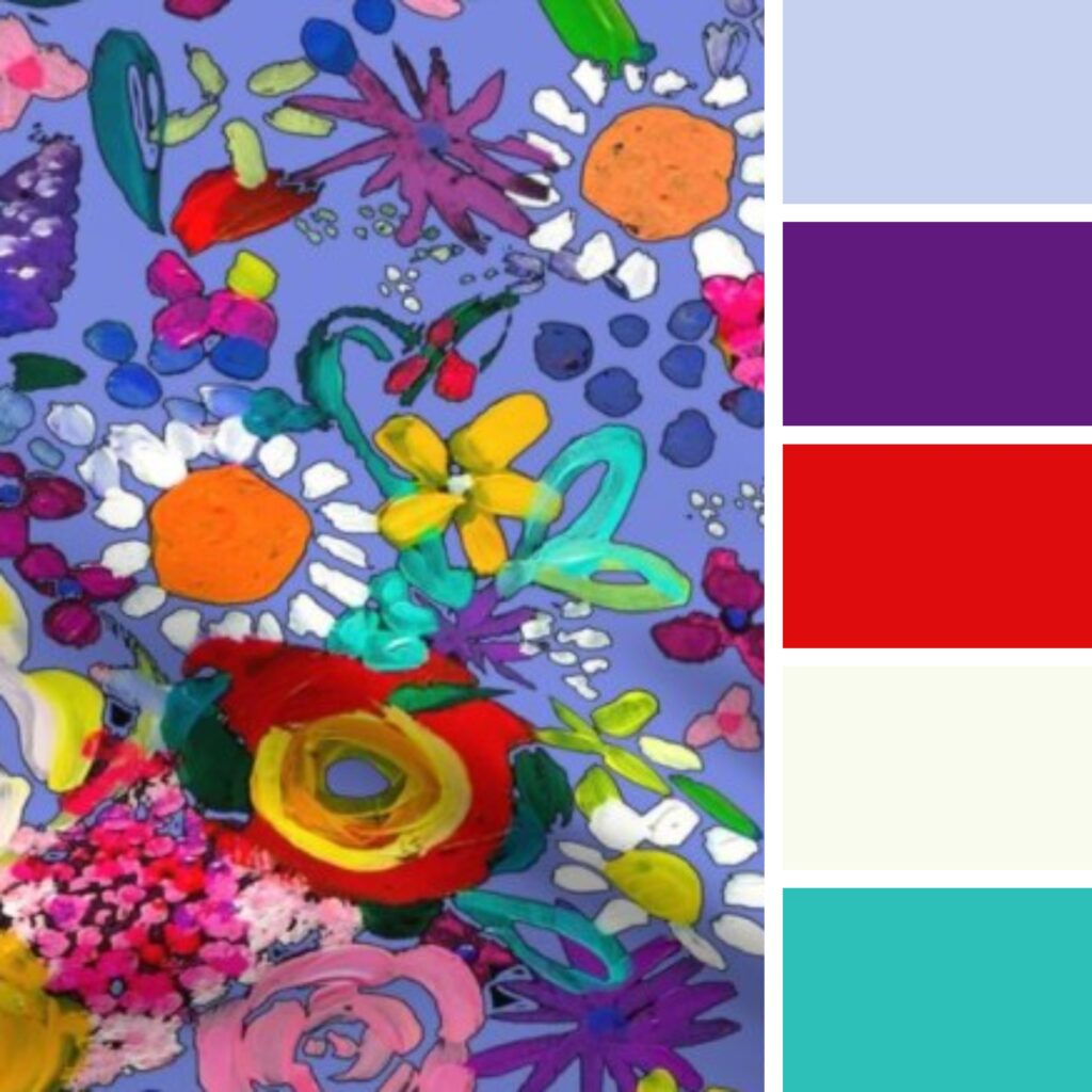
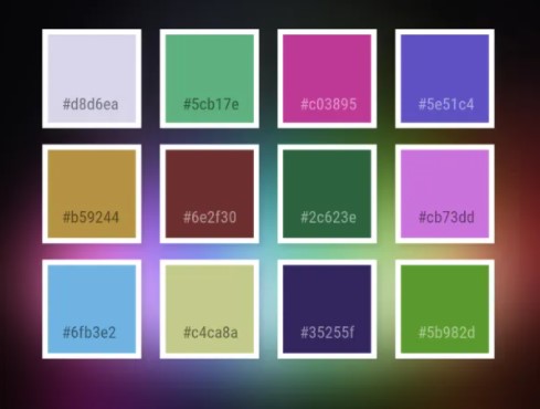
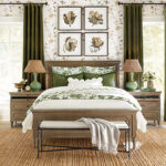
NEUTRAL COUNTRY TONES
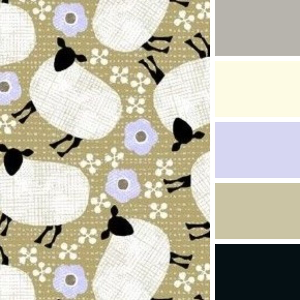
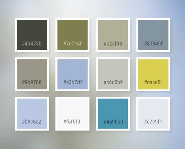
After seeing these possibilities would you use this colour and combinations?
Let me know!!
COLOUR OF THE YEAR – VERI PERI
FOR THE EXTERIOR OF YOUR HOME
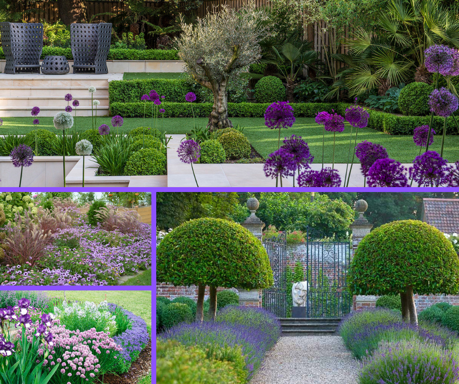
So, how do you add in some Veri Peri to the exterior of your home? Well, the easiest place to start is in your garden!
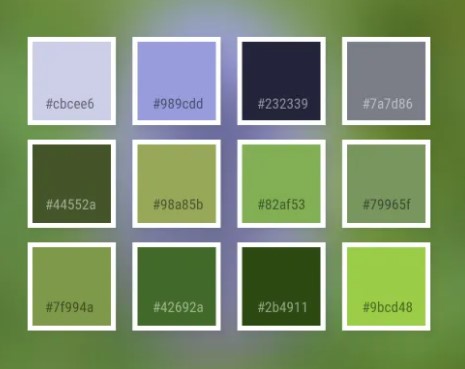
It’s easy to incorporate the colour and all its varieties into your garden. Whether you have a traditional cottage or a contemporary garden, this colour palette is definitely cool and calm.
VERI PERI FRONT DOOR
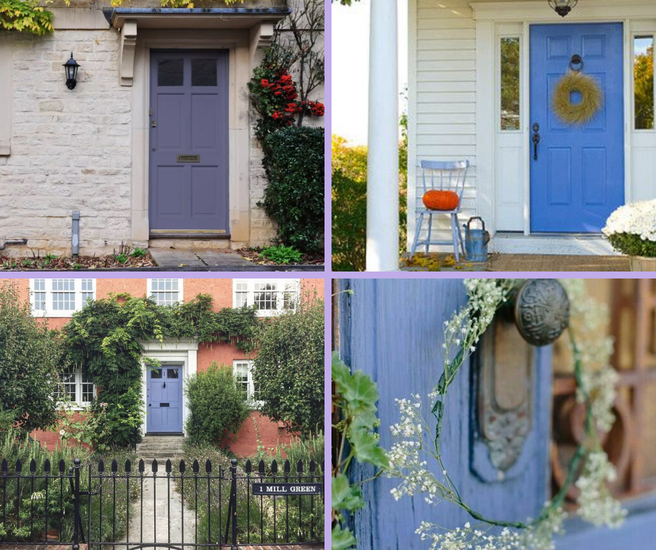
Variations on the colour …but you get the idea. It’s important to select the right undertone of this colour
for it to complement whatever material you’re working with,especially when it comes to brick colours!
All of that from just ONE COLOUR right? I could go on and on about this colour – SO MANY POSSIBILITIES AND OPTIONS TO EXPLORE!!!
You’re sure to notice this colour throughout the year as manufacturers start to distribute new and exciting products for all industries. You probably even have some treasures in your own home in this colour palette that you will look at in a whole new light.
Could your home benefit from a new colour palette?
Are you curious about changing colours or adding a new colour palette to your home?
Choosing the perfect shade is about more than picking a favourite colour on the paint swatch — it’s about finding one that works beautifully with your space, lighting, and design style. Allow us to guide you through the options and select a shade that looks stunning in your home, and gives you complete confidence in your choice. Book your consultation today and let’s get you the makeover you’ve been waiting for.
The house is simply AMAZING! We can’t thank you enough for all the help you gave us in setting up our brand-new home.
Robert B./Orleans, Ont.
Serving busy professionals in Ottawa, Cornwall, Brockville, and surrounding areas.


