Anne-Marie Brunet, CMKBD, CAPS

A professional couple’s Master Suite renovation gets a Luxe Hotel makeover worthy of 5 stars.
This professional couple had done some minor renovations since purchasing their house a few years before. Next on their wish list was renovating their master bed & bath
As they travel regularly, the mandate and direction for this renovation were all about ‘hotel luxury’ and a ‘WoW’ factor, similar to what they experience when staying in luxury hotels.
So let’s dive into the BEFORE and AFTER story;
Here are some of the issues the clients were dealing with;
- NOT having enough counter space in the bathroom
- NOT having enough storage in the bedroom. You would think that a walk-in closet would have been the right solution but…read on
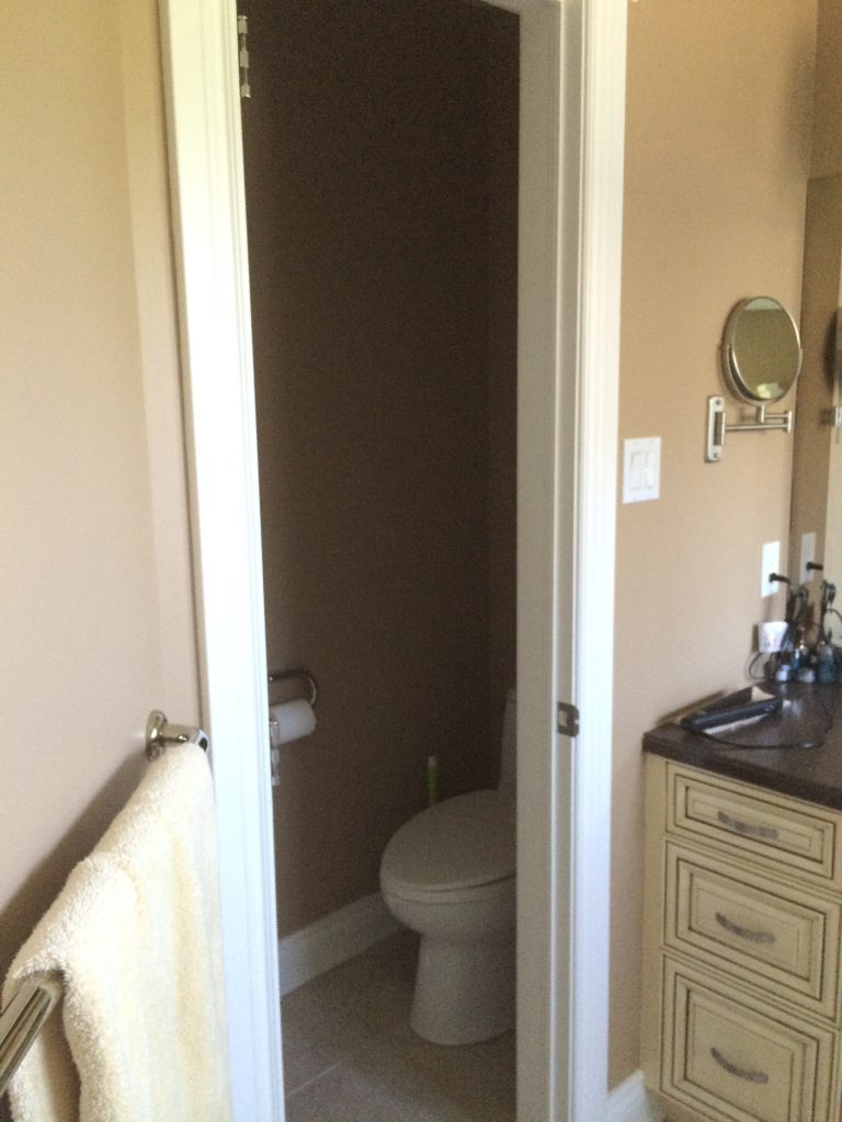
- A very small and very dark water closet
- Lots of DEAD floor space, in both rooms, that was not being utilized to its fullest potential
- NO WOW Factor – both rooms were pretty much ‘plain-jane-vanilla’
CURRENT MASTER BATHROOM DESIGN CHALLENGES
When I first visited the clients and toured their home, they had completed a few smaller renovation projects, and I immediately understood that their current master bed and bath layout and decor was really not their style.
On their ‘must-have’ list for the master bathroom remodel was a larger shower, and I think you will see that we accomplished that without sacrificing storage; in fact, we added LOTS of STORAGE, within a similar footprint.
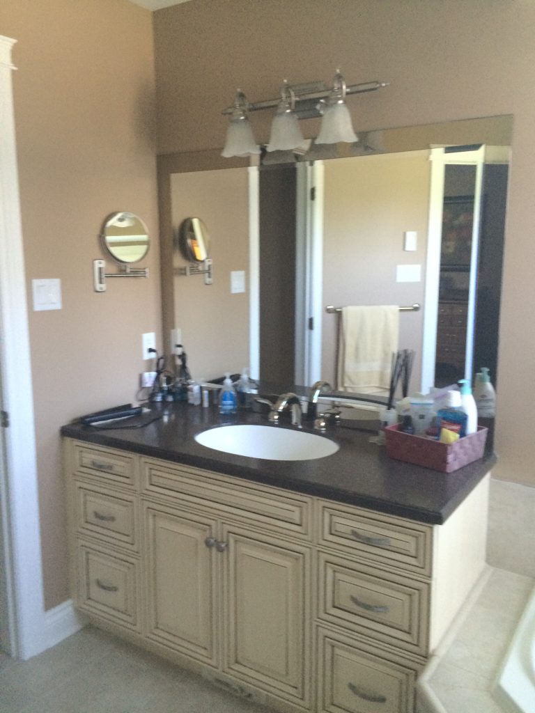
The original bathroom was the usual builder grade with a few upgrades, but the layout and finishes did not work or resonate with the clients, nor was there enough storage – again, lots of dead floor space.
The bathroom was very traditional, and the vanity was painted, antiqued with a darker glaze added. This couple is anything but traditional. They are a hip couple who like originality and contemporary design.
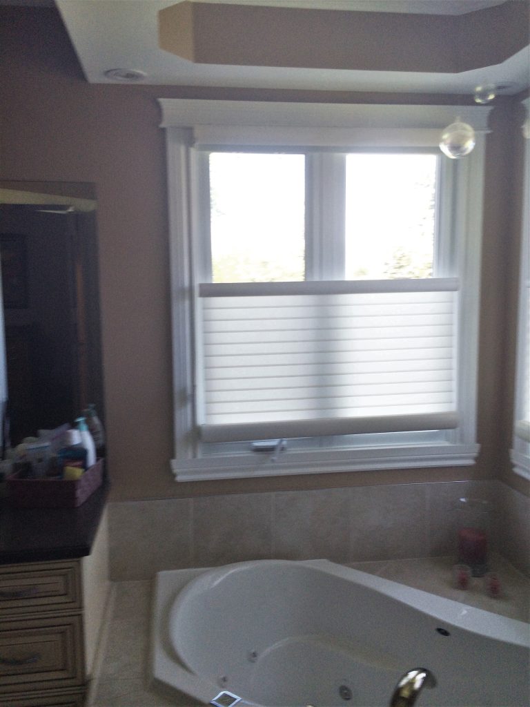
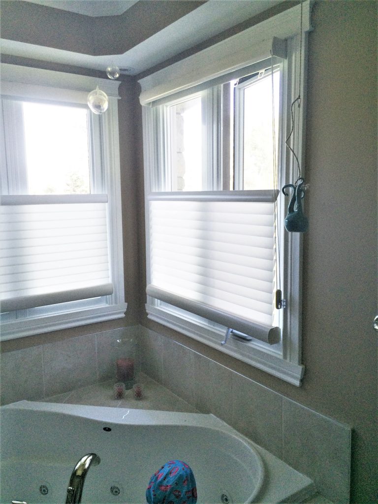
The corner tub, which was never used, restricted access to the windows. The tub was essentially a dust collector, taking up valuable space.
THE PROBLEM WITH CORNER SHOWERS
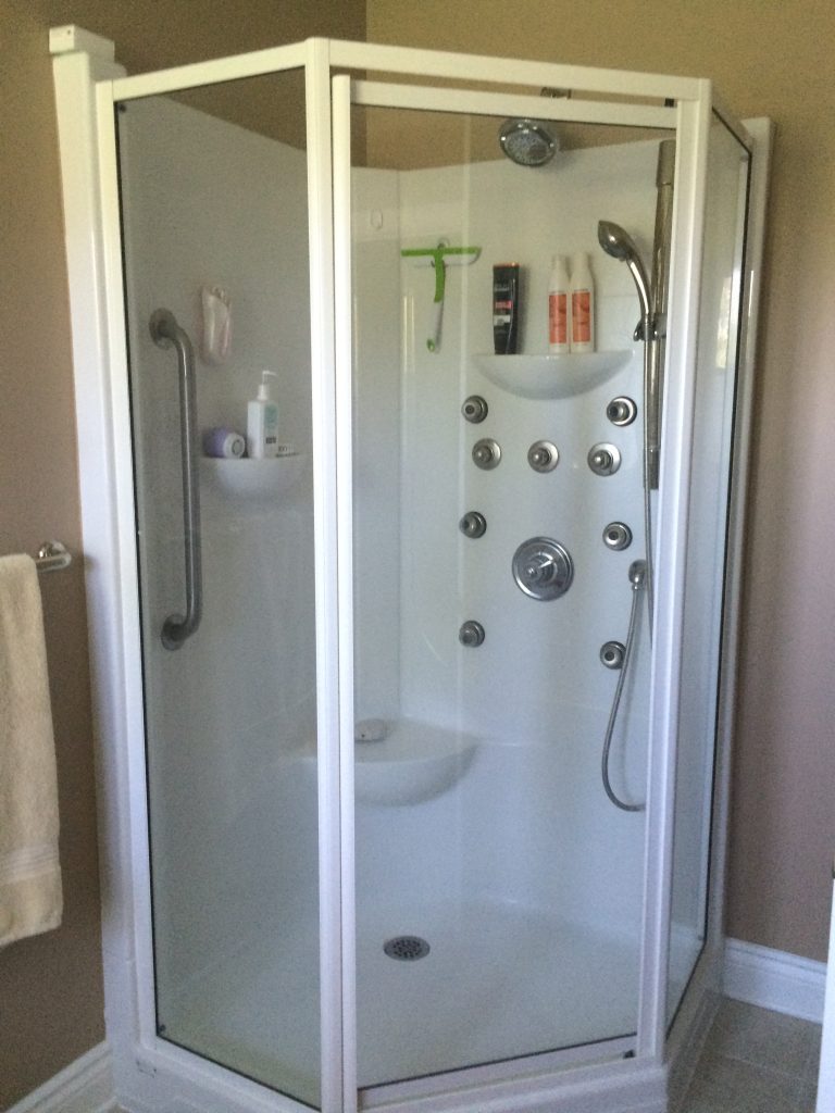
Then there’s the shower, lovingly referred to as the ‘car wash’ shower, haha. I mean, the amount of body jets in this thing for its size, well, no wonder the water was leaking through the doors all over the floor. Plus, it was not a very attractive shower unit, like everything else in the bathroom. DIY corner shower doors have not yet been perfected, and they are not on my ‘favourites’ list.
THE PROBLEM WITH WATER CLOSETS
…and the very cramped and dark water closet. The clients shared with me that there was no point closing the pocket door because the space was that small. Builders should be made to come back and live in the homes they build to understand why this does not work.
MODERN MASTER BATHROOM REVEAL
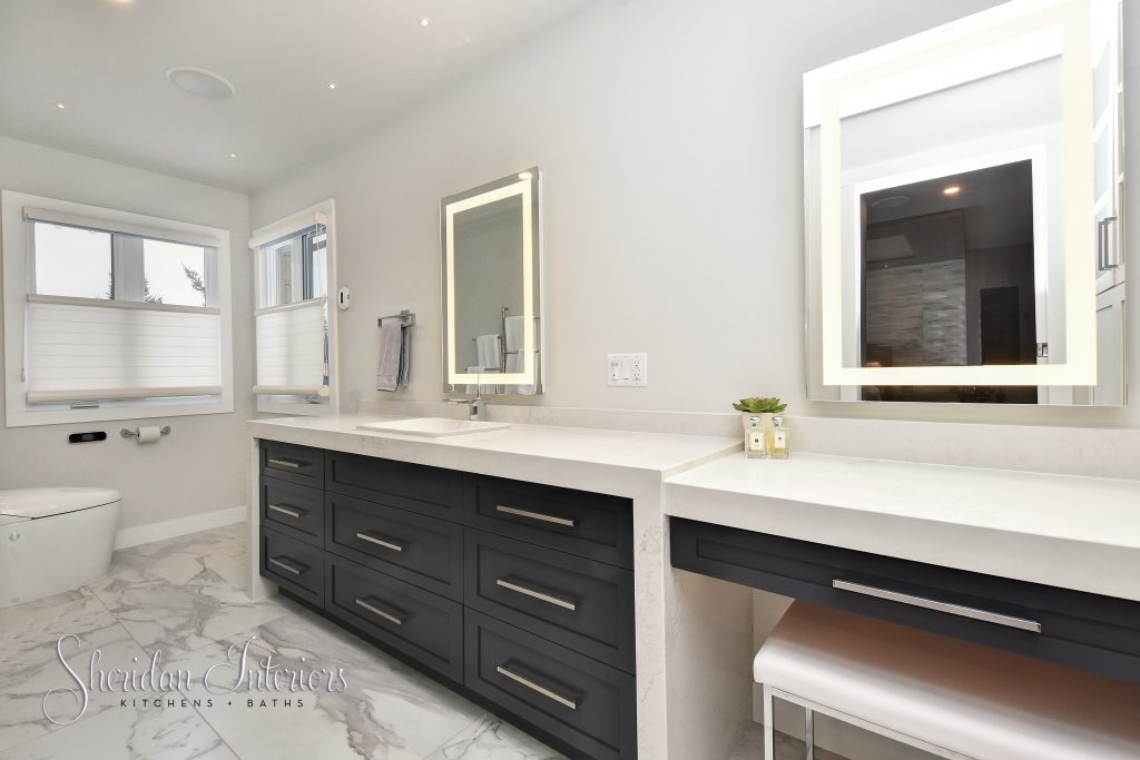
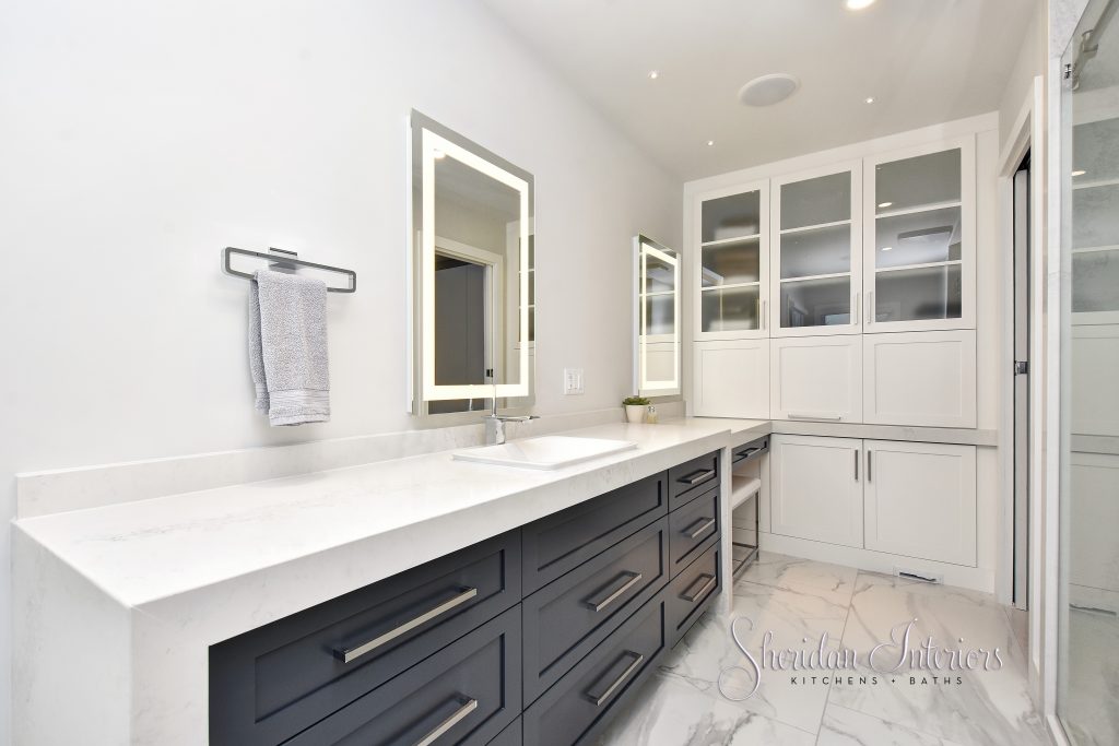
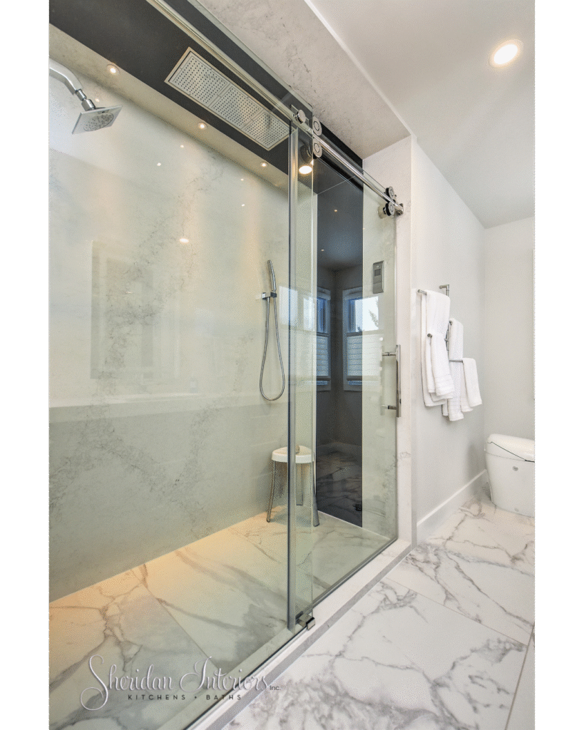
The shower is now large enough that you can move out of the spray and dry off in the shower if you want. Large quartz panels and a handy hand-shower make cleaning this larger shower a breeze.
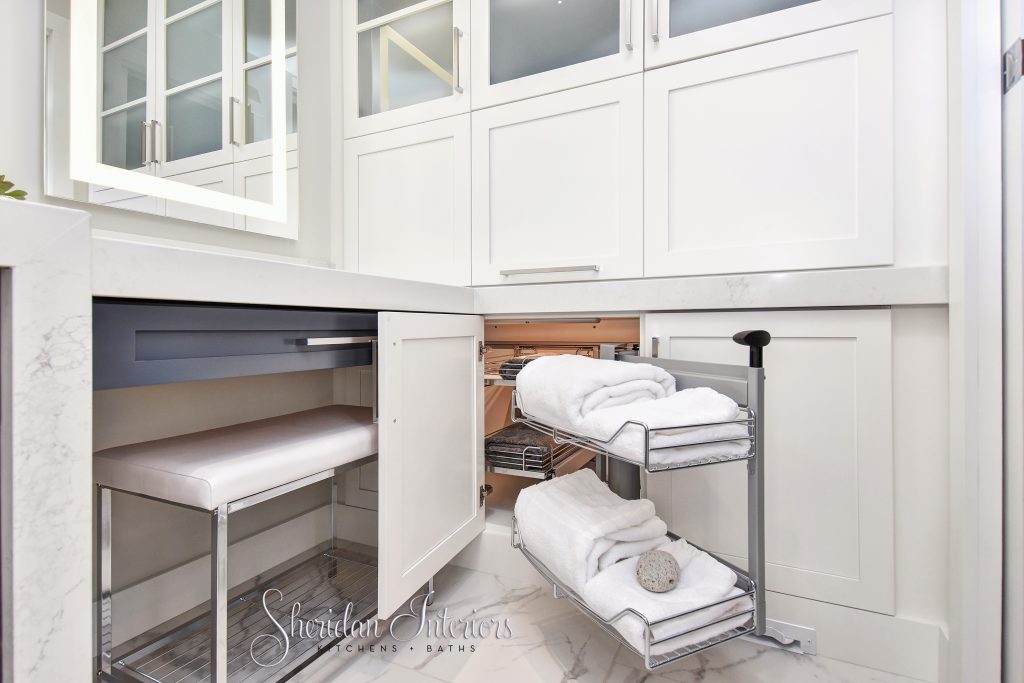
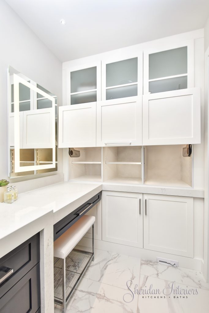
This new wwall of storage used to be part of the walk-in closet. See plan below.
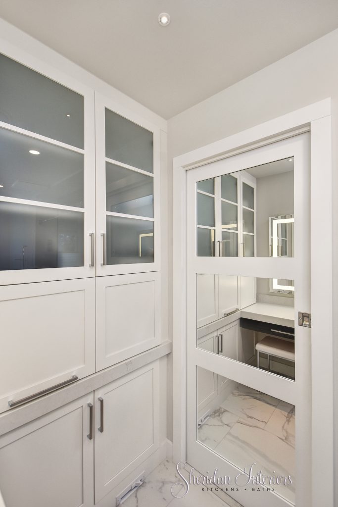
You have to see this gorgeous blue modern bathroom!
HOW TO DESIGN YOUR MASTER BEDROOM FOR BETTER FUNCTION
The bedroom space itself was large enough, but lacked any style. While it has a decent-sized footprint, the space was not being utilized to its full potential. The bedroom looks onto a gorgeous golf course, but in this current situation, you’d be hard-pressed to get excited about it.
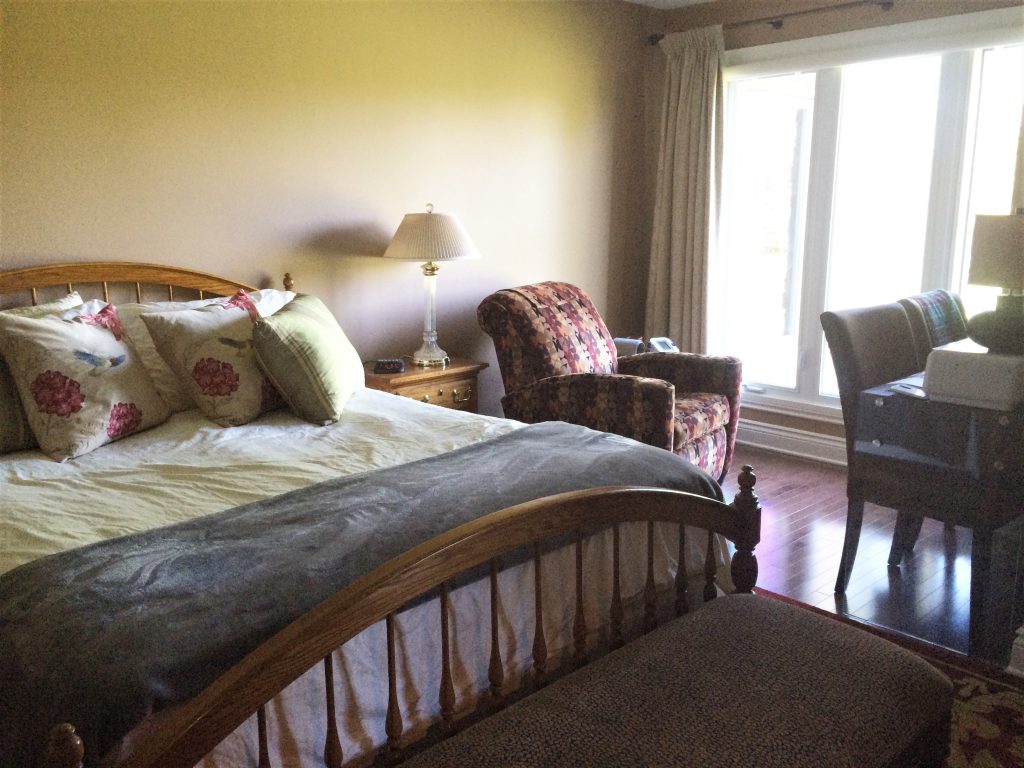
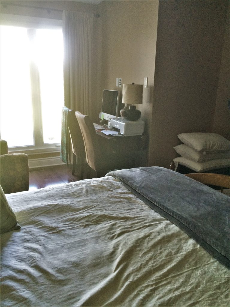
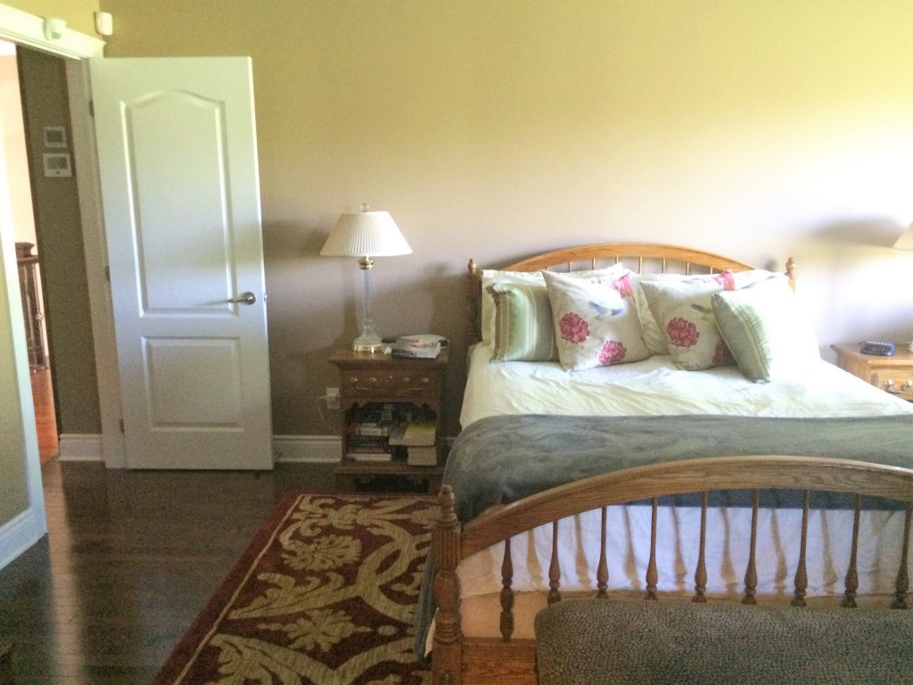
The furniture also needed to be updated to better align with their contemporary design aesthetic. More on this later.
Now, when I get designing, I can usually always find more than one way to lay out a space, and I can’t help but explore all possible options for my clients. For the bathroom portion, I came up with 5 different viable layouts, and ultimately, this layout got the green light.
In the plan below, you can see the as-built floor plan (the lighter lines depict the walls as they were) against the new layout. You can see how much the bathroom’s water closet encroached on the bedroom and window space. It certainly didn’t leave much space for the bed.
While the biggest impact was in the bathroom for sure, the rest of the bedroom really gained much-needed organization and lots of WOW factor with unique details, materials, and products.
The bedroom now functions so much better for their needs, has lots of storage, and definitely suits their style. Scroll down for more pics.
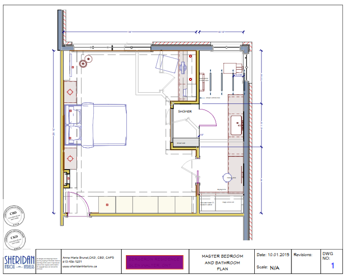
Another part of the mandate for this renovation was to open up the views to the golf course. With some thoughtful design tweaks, I was able to accommodate a much larger window to take in those views, and oh what a difference it made to the overall feel of the room.

The client also wanted a computer station in the bedroom to check in on work in the early morning or late at night as required. Scroll back up to see what she was using for a desk station before 🙂 The new desk is now tucked behind the feature wall and is no longer the focal point when you walk in the room, AND it’s so much prettier.
I planned the shower access panel so that it would be hidden somewhat beneath the desk top.
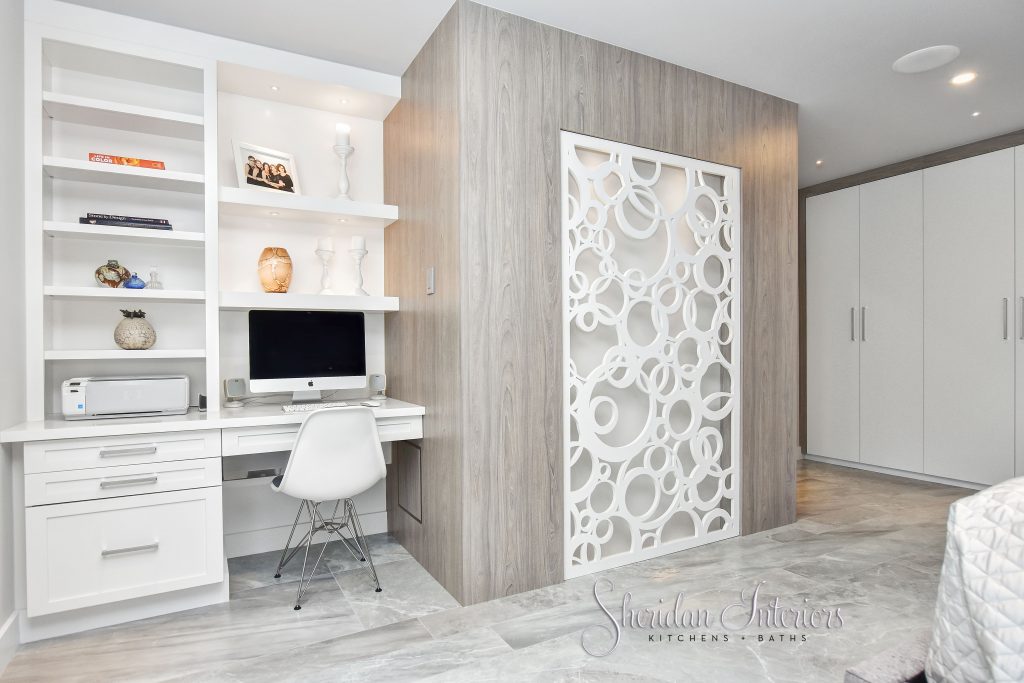
To minimize the visual weight of this new ‘box’ in the room (it houses the shower on the other side), I decided to make the most of the opportunity and create a focal point or feature wall.
We could have hung a painting here, but the clients wanted something more original. So in my design, I specified a custom laser-cut panel made to sit flush with the front of the ‘box’.
I included a recessed space behind the panel and installed lighting behind it. It’s absolutely gorgeous at night. Adding the lighting also serves as ambient light and can be seen from the hallway when they are entertaining.
MASTER BED & BATH FRAMING
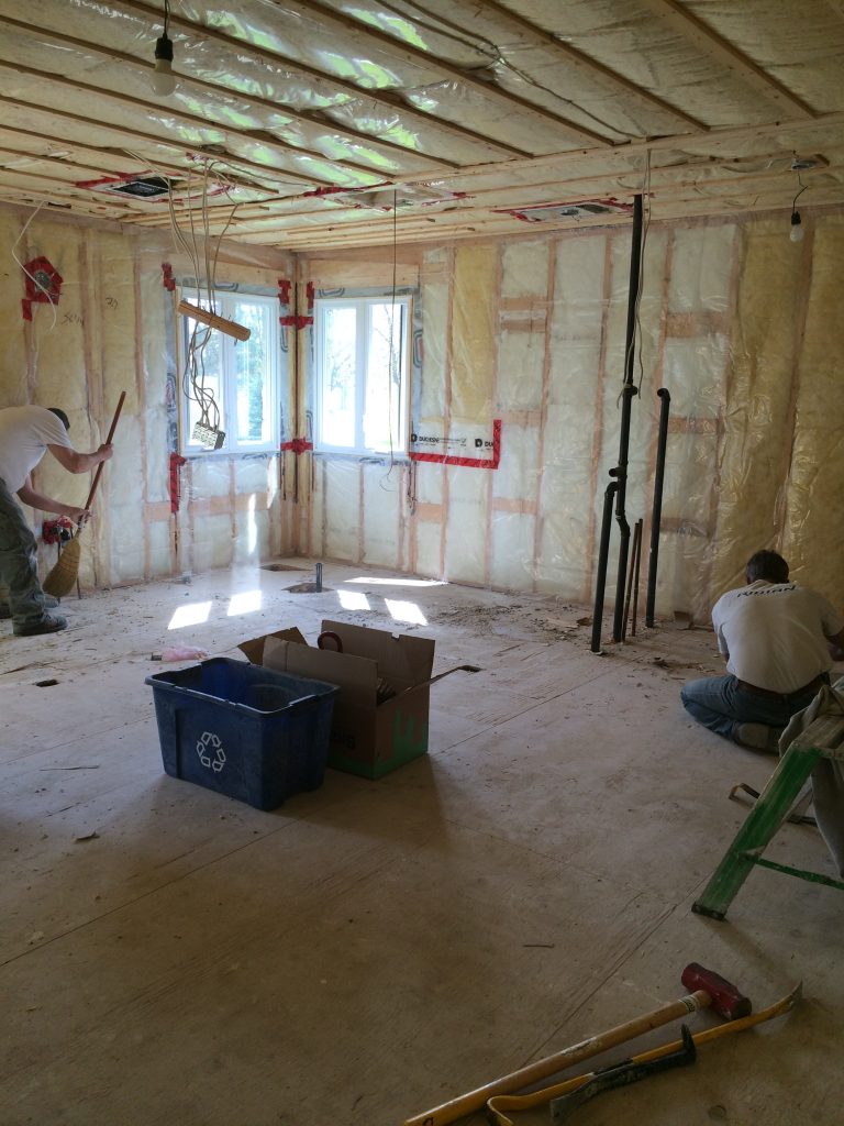
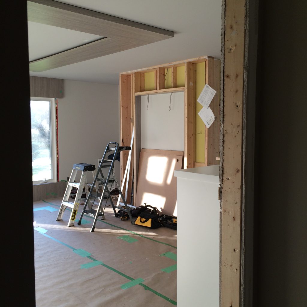
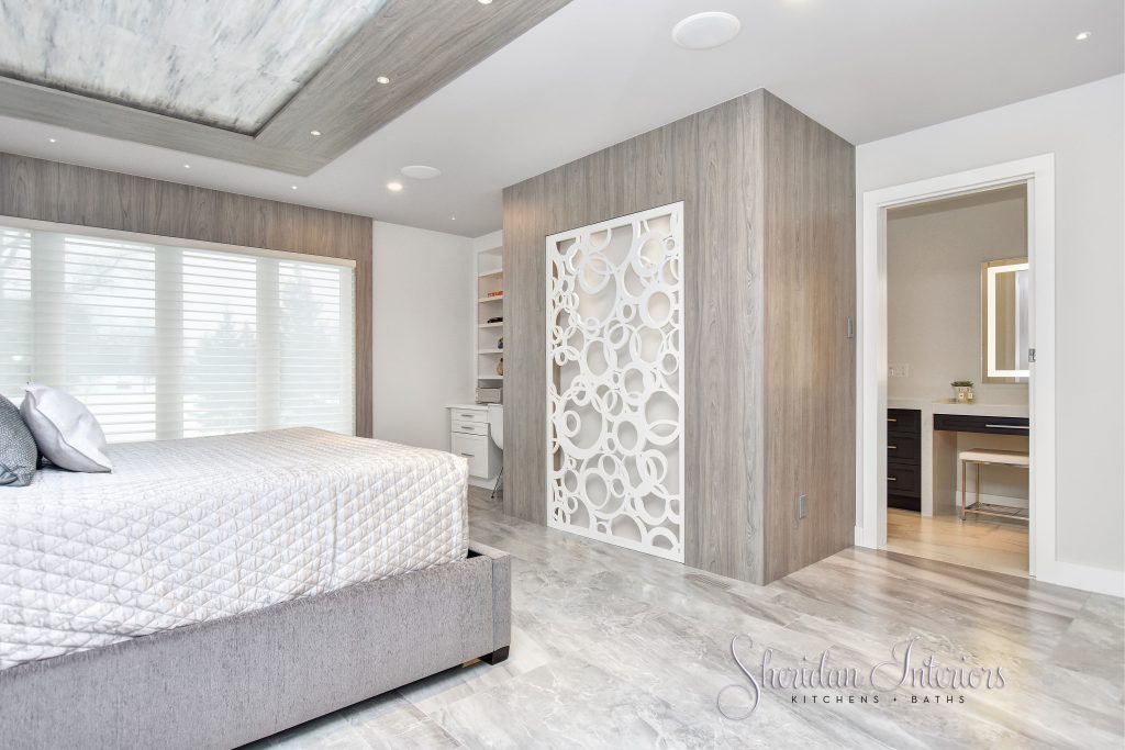
You can notice the build out around the window in the image above. I did this for two reasons;
1) so that the new window shades would sit flush and look built-in, since the window jambs were very shallow.
2) the panelling surround adds importance to the new larger window, and ties in with the same finish throughout the rest of the room.
MASTER BEDROOM BED TYPES
The bed wall would also get its own special treatment with additional details and drama.
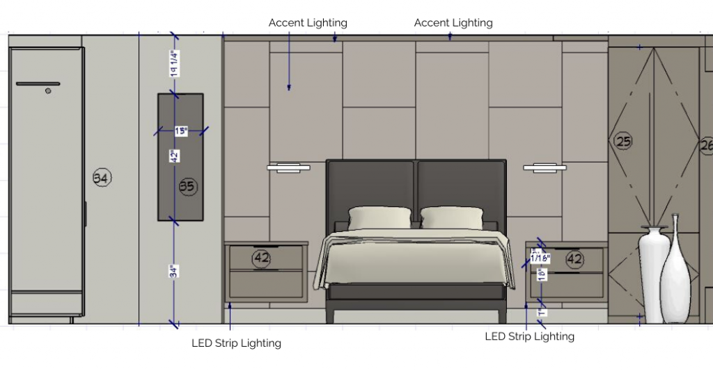
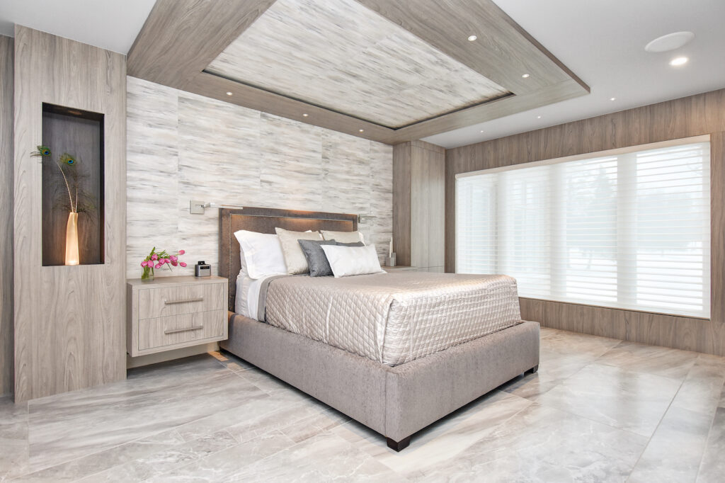
I designed custom cabinetry to surround the bed and also included a dramatic ceiling detail above it. All these CUSTOM pieces were specified in the same ash finish to balance out the room and give it some presence. Doing so created a nice crisp contrast against the light pearlescent hand-painted paper behind the bed.
The large cabinet to the right was designed for accessories: scarves, belts, and jewellery. No space wasted in this room!
To balance out the left side, I designed a bump-out with a niche, in a darker stain, to display a sculptural object and add an artistic touch. An uplight was added for extra drama through a clear vase.
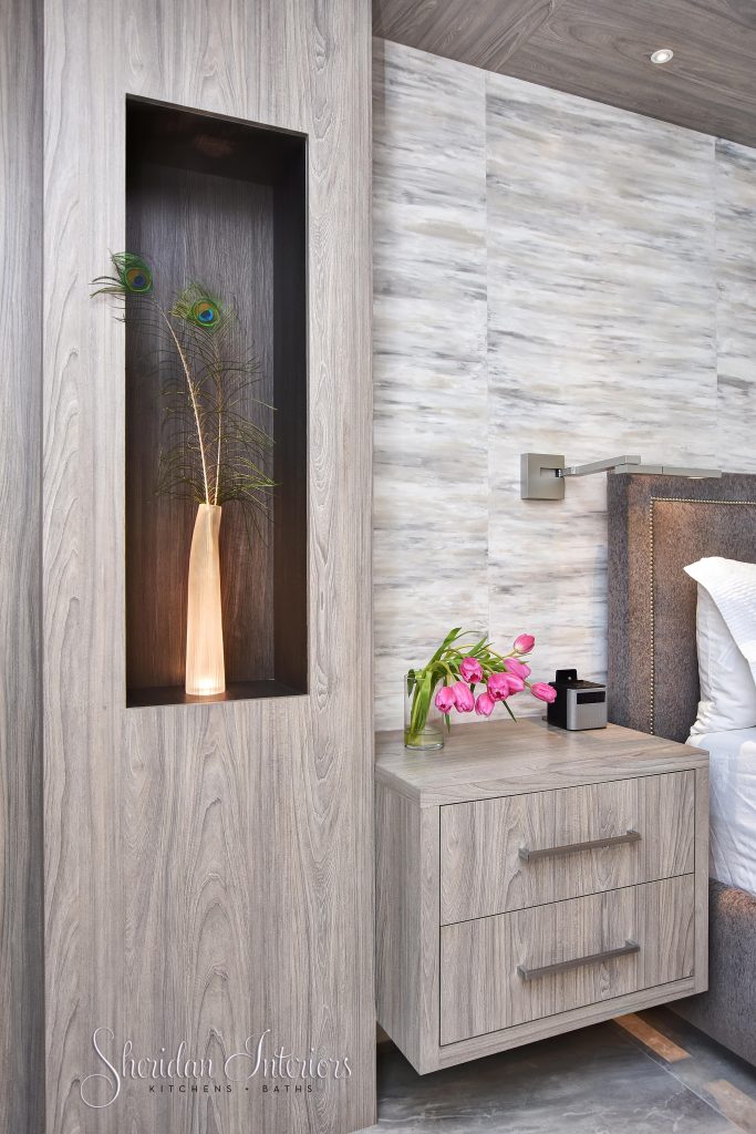
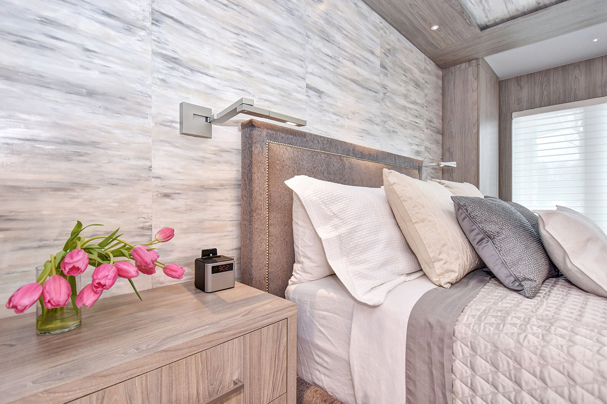
The floating nightstands enhance the contemporary styling and have LED lighting underneath them. The lighting underneath serves as both ambiance lighting and as night lights when needed.
CUSTOM HAND-PAINTED WALLPAPER FOR FOCAL POINT
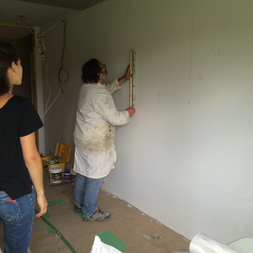
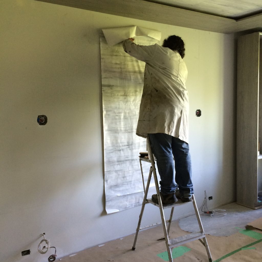
The paper behind the bed is hand-painted to resemble Abalone stone panels. Careful planning and handling of this custom paper is required to ensure a seamless finish, and it looks like stone slabs.
I used the paper on the head wall and the ceiling in the recess of the overhead panel
WHY A WALK-IN CLOSET MAY NOT BE THE ANSWER
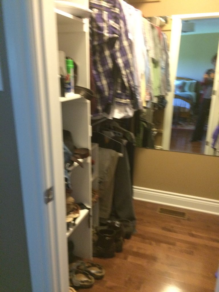
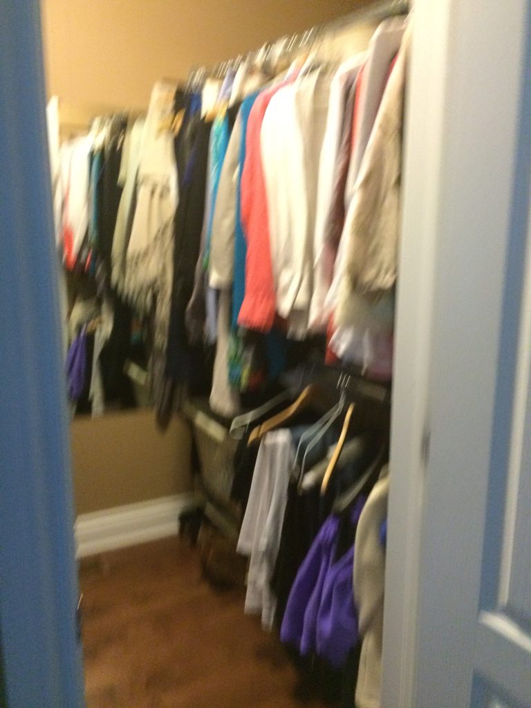
The original walk-in closet was odd in the sense that the right side of the closet was positioned above a hall closet on a lower level. That created a really deep recess on one wall, with a shelf so deep that a lot of stuff got lost and forgotten way at the back. It was a wasted opportunity in terms of storage.
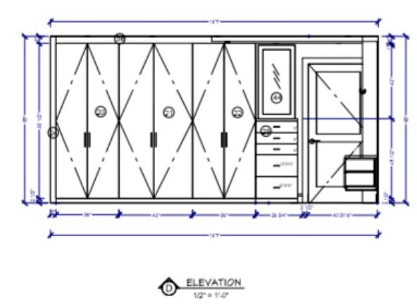
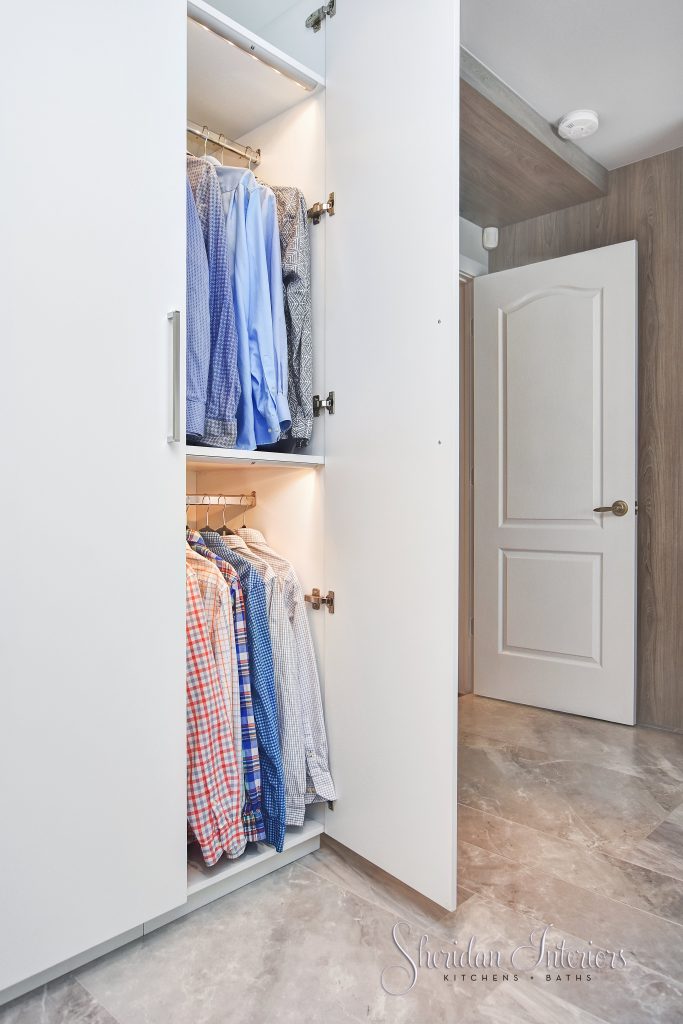
In my new design layout, I took out the walk-in closet (gasp!) and replaced it with a wall-to-wall reach-in wardrobe with lots of organization and interior lighting in each section, and a built-in dresser with mirror.
Here’s a look at the wall elevation for the closet wardrobes.
In the photo below, you can see the different interior options for the wardrobes.
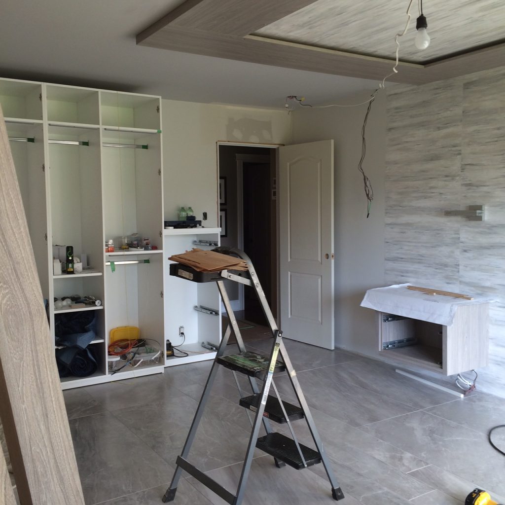
This new design works so much better to keep them both organized, each with their own section of storage.
HOW TO USE A LARGE-FORMAT TILE IN A BEDROOM
By now, I’m sure you have noticed that the wood floors were also replaced.
Using large-format porcelain tile in this beautiful stone-look pattern was the right fit for the contemporary-luxe hotel vibe.
In the bedroom, I used the same tile pattern in two different widths for added detail and interest. This also breaks up the expanse of tile in the room. You can notice this detail a bit in the photo above.
In the bathroom, I used the same tile pattern but in a lighter colour to blend with the quartz materials. Using the same tile in each space gave me the freedom of not having to use any kind of trim piece to merge the two tiles. This creates a much higher-end look and better visual aesthetic without any distraction.
CHOOSING THE RIGHT BEDROOM FURNITURE FOR YOUR RENOVATION PROJECT
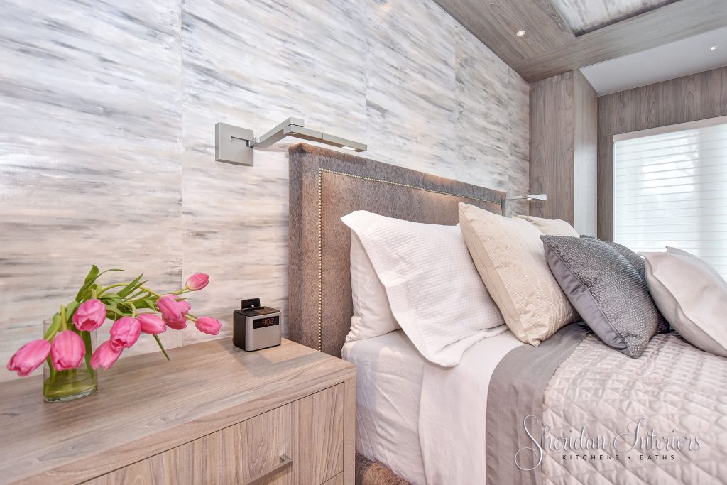
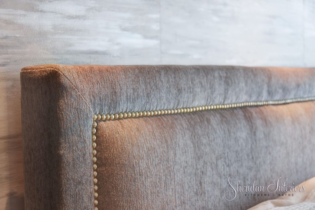
I was able to guide the client to a platform bed in a soft grey fabric that coordinated with all of the other materials and finishes in the room, for a luxe, lush yet soft look. Contemporary and slim wall sconces free up the nightstands and shine light where they need it when they need it.
You can see the completed project and read more details here.
IS YOUR MASTER SUITE READY FOR A LUXE UPGRADE?
If you’re ready to leave the chaos and clutter behind, click on the button below to schedule your FREE 30-minute call to learn how we help clients organize and beautify their suites. You deserve your own sanctuary to brighten your morning and soothe your evenings – it’s all just one click away!
Serving busy professionals in Cornwall, Brockville, Ottawa, and surrounding areas




Marina V
| 19 April 2020Great job!
Anne-Marie Brunet
| 20 April 2020Thank you Marina – the clients are thrilled!