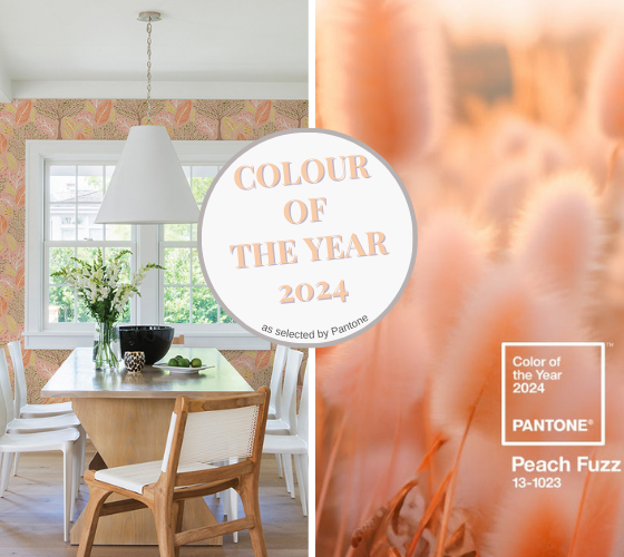
It’s that time of year again – time to explore Pantone’s Colour of the Year for 2024 – Peach Fuzz!
What it’s not. It’s not about Junior getting his first whiskers or the actual fruit revival, but it just might make you long for some juicy fruit and warmer weather.
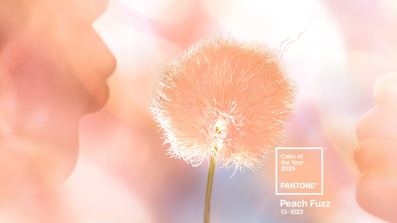
While I don’t usually get overly excited about these colour announcements, as a designer and
lover of colour I like to challenge myself and explore the possibilities.
Now before you turn up your nose, as I almost did, Peach Fuzz brought me back to my first ‘grown up’ apartment which was decorated in a palette of warm peach, cream, ivory, brass, and glass, with modern furnishings from Van Leeuwen Boomkamp – THE furniture store ‘o-the-day, synonymous with excellence.
As I re-acquaint myself with this colour, I am reminded how easily it integrates with different architectural styles and aesthetics, and the interesting colour combinations available to play with.
As with every new ‘Colour of the Year’ it will be borrowed, tweaked, and played with, and take on different values to satisfy one’s aesthetic, and that’s the point of making design work for you.
…and if you haven’t already noticed the general marketing around you, either in magazines, digital, or TV, this colour is popping up everywhere.
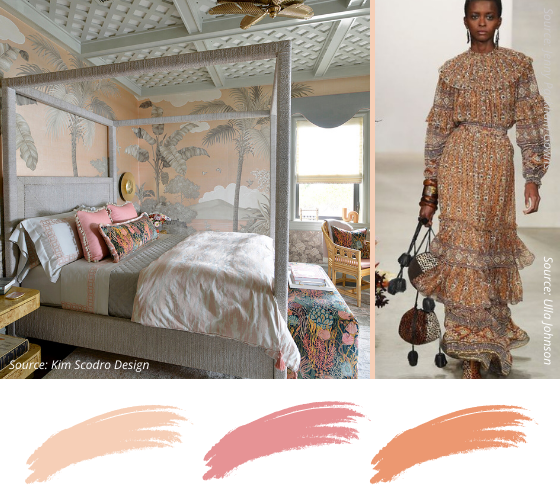
And now time to explore how to incorporate this adaptable colour into home and fashion
with some serious eye candy!
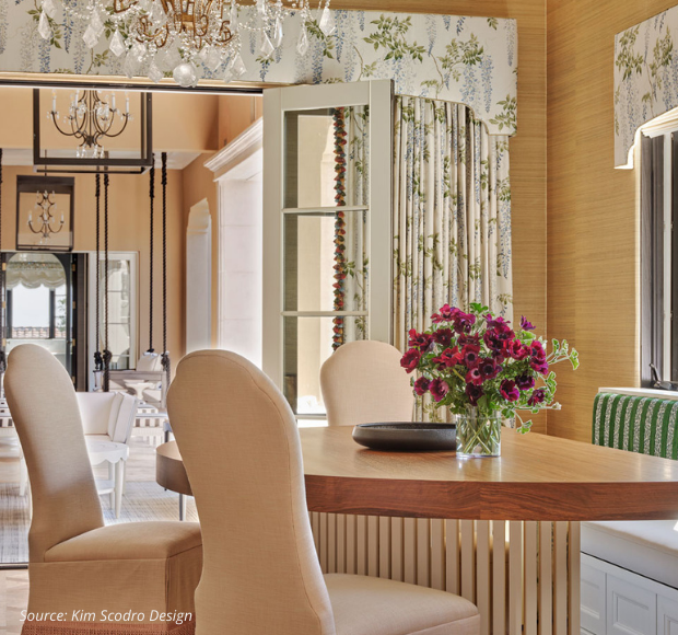
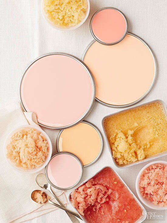
SUNNY & CITRUSY
Like a warm spring breeze, this colour palette breathes new life and warmth into interiors
and brings with it such a ray of sunshine.
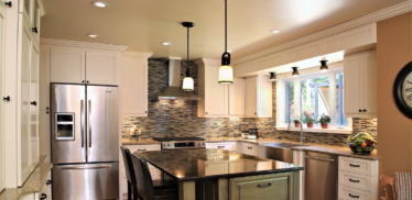
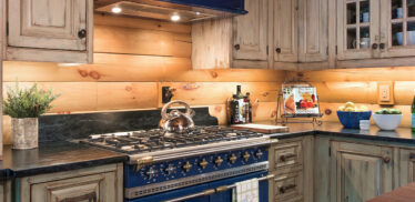
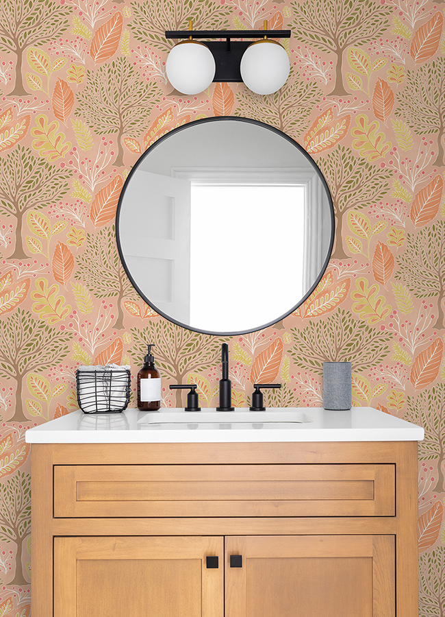
OAK CABINETS? … no problem
For those of you still rockin’ your oak cabinets – this is a lovely complimentary palette
to upgrade any room with lots of natural or stained wood.
The good news? Natural wood cabinets are coming back and oak is in!
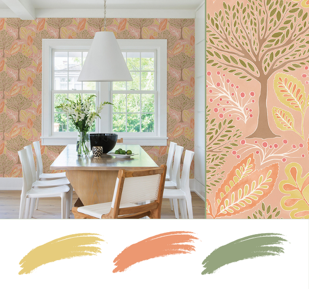
COOL & COLLECTED
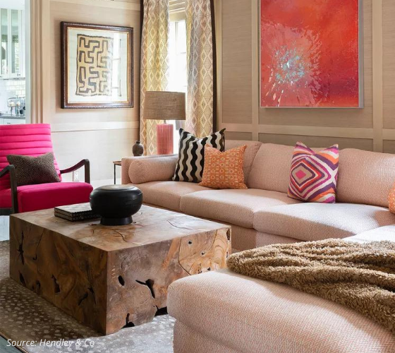
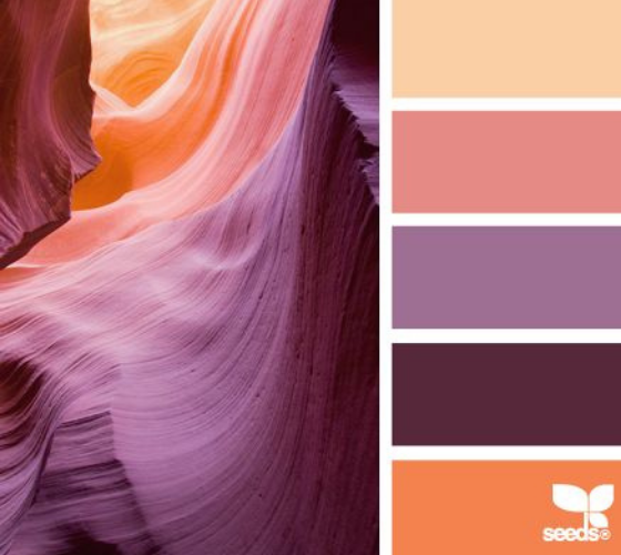
This is where you get to play with the value and tone of a colour like Peach Fuzz.
If you’re less enthusiastic about the orange undertones, tweak it and change it up to get
a cooler undertone, then add in varying levels of the gradient for accents.
BOLD & BEAUTIFUL
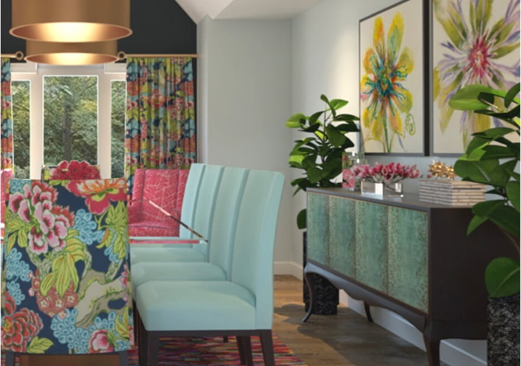
Here are some seriously colour-drenched pairings to consider
for colour combinations and palettes.
You can use all of these in one room – yes you can – or use these palettes as inspiration
to infuse a little happy colour in whatever room is needing a little jolt.
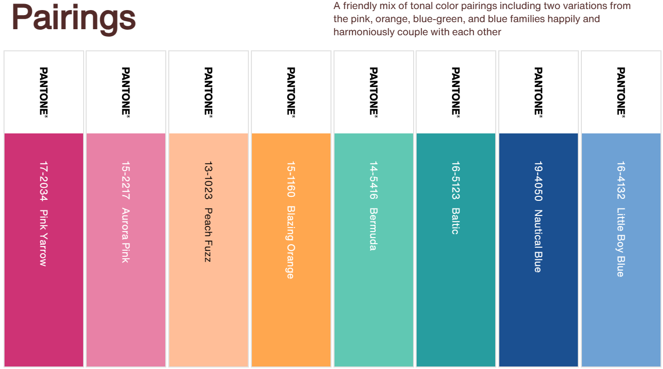
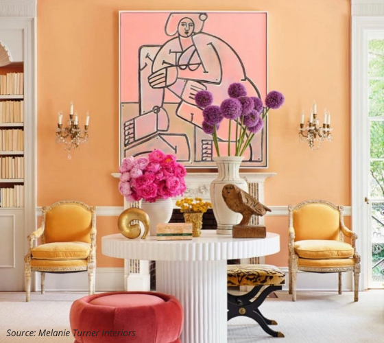
I love how the purple, fuchsia, and pink turn down the heat in this room and give the eye a place to rest.
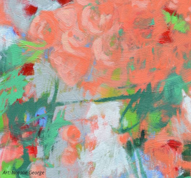
BOLD ART
…on walls
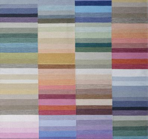
…and underfoot
Pantone Colour of the Year 2022
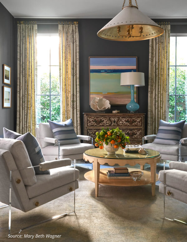
Gray Interiors…but Updated
I know there are still plenty of gray interiors out there and for those of you craving a bit of an update here are a few options.
1. Change up your Walls. Use paint or wallpaper to liven up an all-gray room. Peach is soothing, calming and a great colour to warm up a gray room.
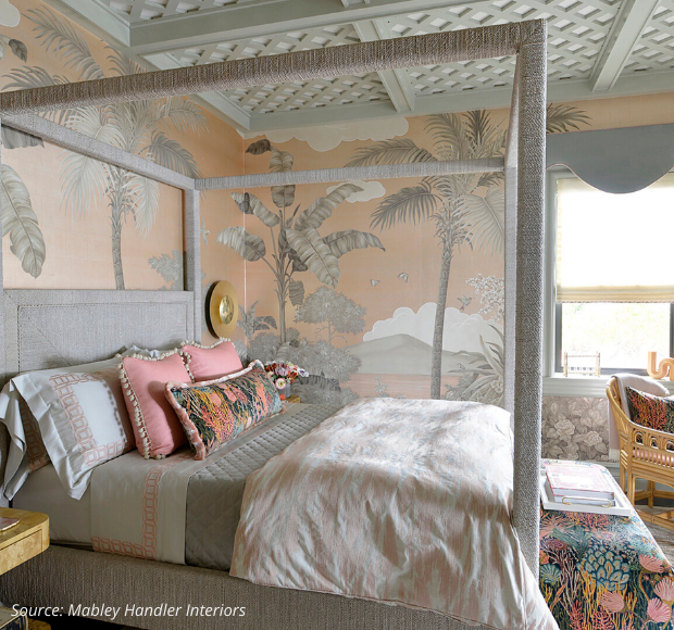
2. Lighten up your monochromatic gray interior with a warmer palette. Soft creams, coral, peach, lighter blues, and brass warm up what could have been a bland and cold room.
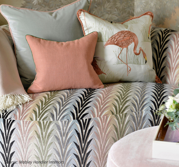
3. Update your Textiles and Accessories
Add in new pillows, throws and accessories. Look for more modern patterns and colour combinations. Re-upholster a vintage piece in a modern pattern – you’ll be amazed how that brings it to life!
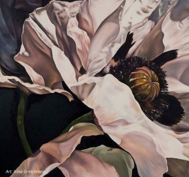
4. Get Moody
All gray interiors can sometimes lack definition. Try adding one or 2 statement art pieces. These will create a focal point and add depth to the room.
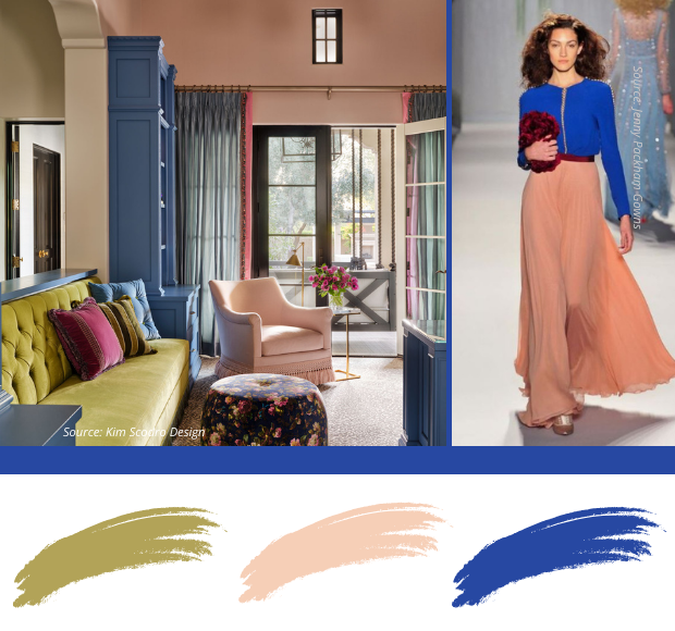
When DESIGN & FASHION Align
It’s difficult to say which influences the other first, Fashion or Design, as they co-exist so closely in the design world, but influence each other they do. Here are two great examples of how they cross over effortlessly into everyday facets of your life and home, showcasing this year’s featured colour.
COOL TONES
WARM TONES
Let’s hear it for the boys!!
A masculine mélange incorporating this colour for the men who appreciate
the world of fashion and design.
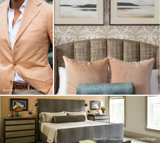
Some WOOD SPECIES (like in the image above) and the classic CAMEL Cloth (like in the image below) can sometimes take on a peachy tone – and that’s all right I say 🙂
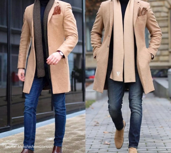
There you have it! Peach Fuzz – what do you think?
Do you have a new-found appreciation for this colour?
I hope this has given you a new perspective on how to use, blend and coordinate this colour with different palettes, and how you can refresh your existing spaces. I hope it has filled you with a little excitement about tackling your next project!
Enjoy these beautiful Dahlias, as we wait for signs of fairer weather 🙂
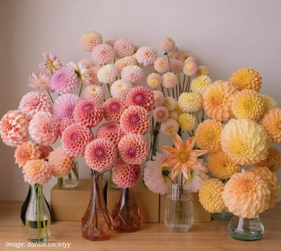
You’re sure to notice this colour throughout the year as manufacturers
start to distribute new and exciting products for all industries.
You probably even have some treasures in your own home in this
colour palette that you will look at in a whole new light.
Working with Anne-Marie solidified the benefits of working with
a professional designer to make our vision a reality.
-Catherine
Williamstown, Ont.
Have a project you’re contemplating
Tell Us About Your Project
Serving busy professionals in Cornwall, Brockville, Ottawa, and surrounding areas


