Anne-Marie Brunet, CKBD, CAPS
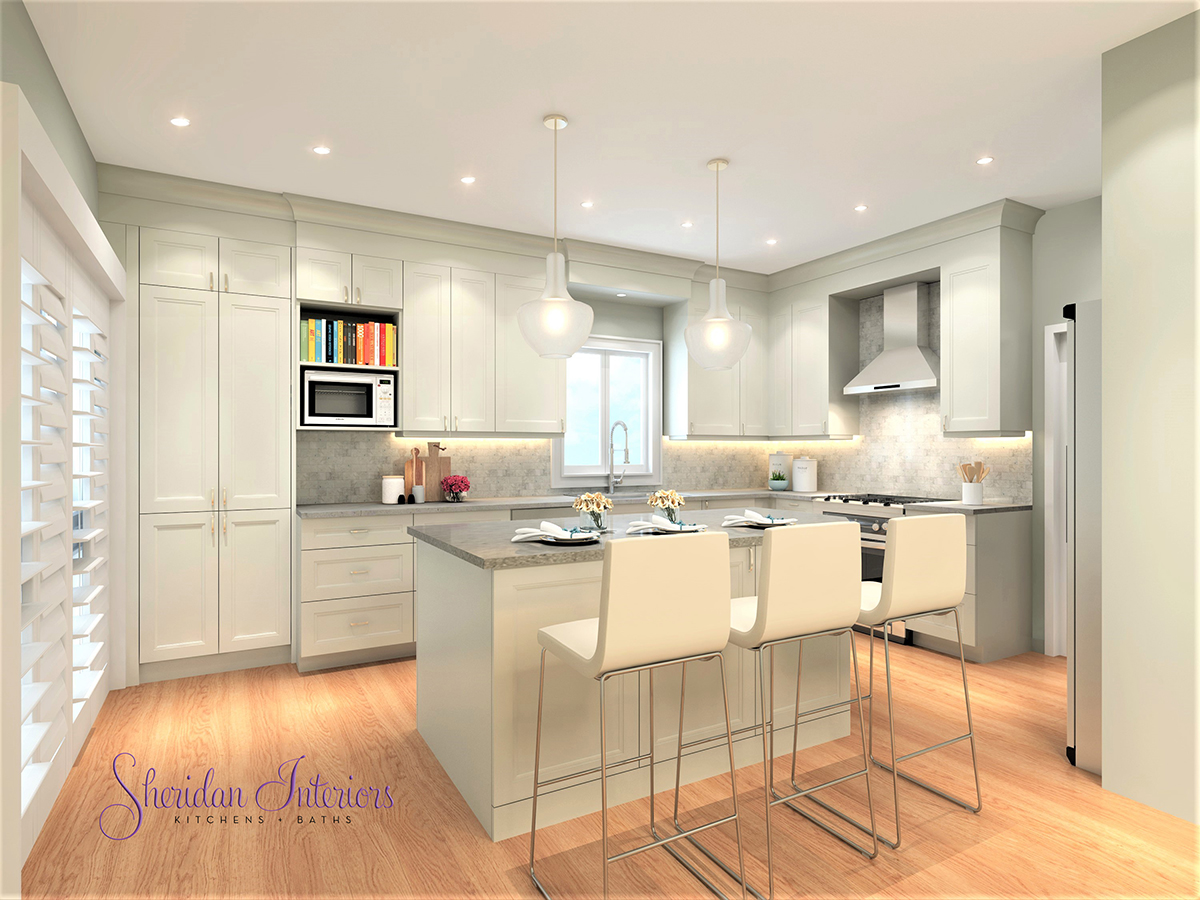
They say that good things come in small packages, well this Ottawa small kitchen renovation delivered big on functionality, storage, and the ‘pretty’!
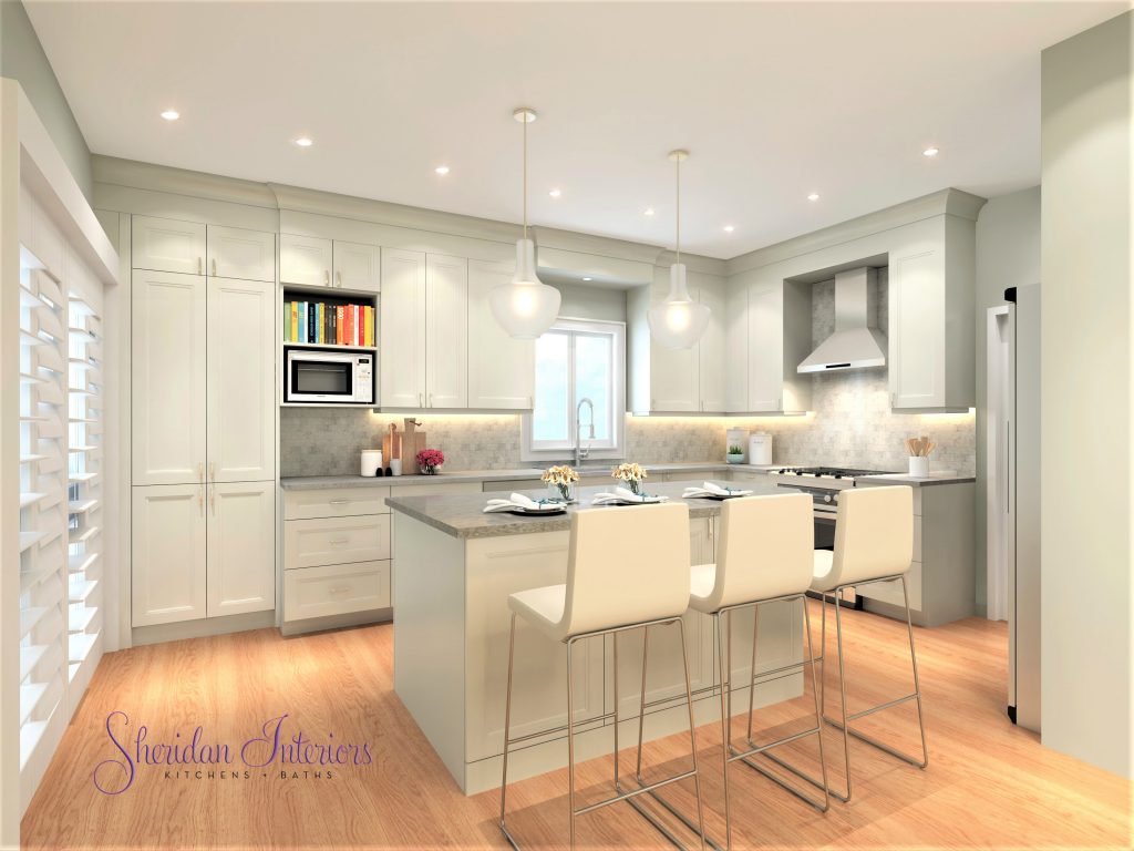
A young Ottawa couple reached out to us to help them redesign and update their small, builder-grade kitchen. It was barely functional, and over the years, they’d managed to make some small upgrades, such as replacing the sink and faucet and buying a newer, larger refrigerator. However, none of these ‘upgrades’ helped them deal with the daily challenges of working in a kitchen that just didn’t work for them.
TIP: Doing these types of upgrades without addressing the real issues will rarely provide the long-term satisfaction you’re looking for. That said, everyone needs a little ‘win’ sometimes, even if it is short-lived.
Most of us don’t have the luxury of having one of those big, bright, beautiful kitchens, we so often fall in love with in the design magazines, and for some of us, even an addition to the house to add extra space is not in the cards either, BUT that doesn’t mean that your small kitchen can’t live large and be functional.
With the right design tweaks and a bit of ‘blending and mixing’ the right materials, it’s absolutely possible to have a beautiful AND functional small kitchen.
Just look at how we transformed this tired kitchen. I think you’ll agree that the ‘AFTER’ is much more functional than the ‘BEFORE’…not to mention that ‘PRETTY’ was invited and stayed!
So let’s dive into the BEFORE and AFTER story.
Common Issues in Small Kitchens
Here’s what we had to work with and some of the issues the clients were dealing with. You might be familiar with some of these if you’re also dealing with a small kitchen.
- NOT having enough prep space/counter for two cooks..they kept getting in each other’s way while trying to prepare meals…
- Only 1 bank of drawers (standard offering in most new homes)…
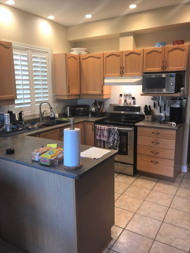
TIP: Cabinets with 1 large door should be used sparingly throughout a kitchen. The best function for these is to store tall items or large appliances. Use drawer cabinets as much as possible.
3. NOT enough storage – they purchase a lot of food in bulk, and we’re running out of space to store items.
4. Cabinets that are too deep to access the back of each shelf – so you forget what’s in there and buy more of the same…
Read How to Plan for a Successful Kitchen Renovation
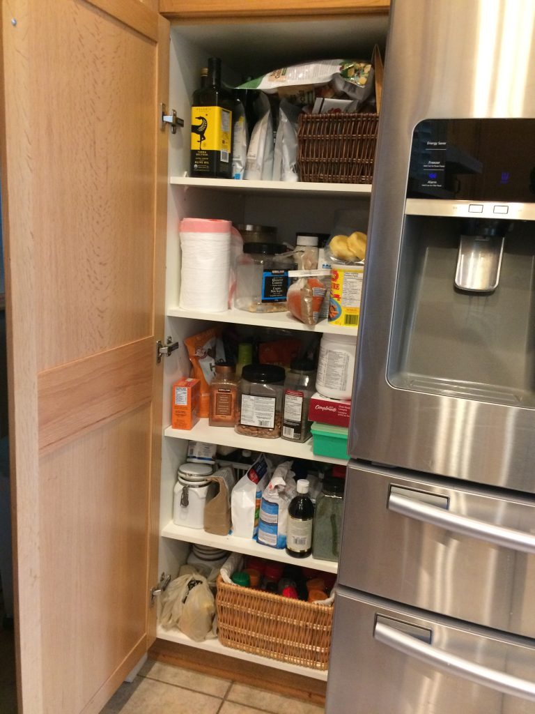
5. NO cabinet organization accessories…everything just jumbled together…
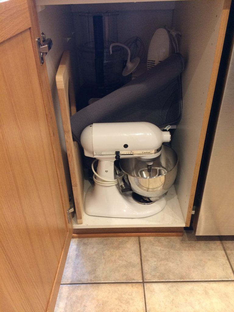
6. Inaccessible corner cabinet (rendering them completely useless – unless you’re an elf)….
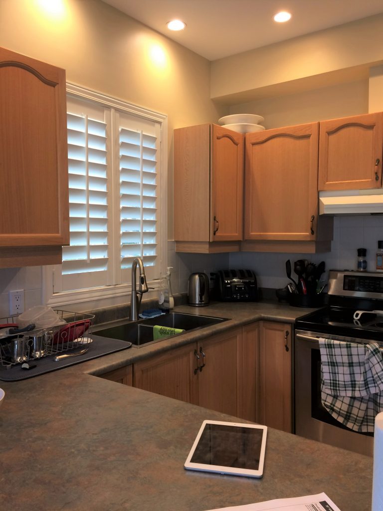
7. Trash and recycling access that collide with other appliances or cabinet doors, thereby reducing functionality and ultimately damaging doors…
8. The shutters at the kitchen window can’t open because of the ‘upgraded’ faucet…which means they can’t open the window either…oops!
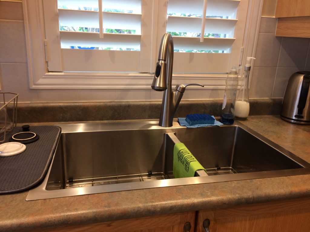
TIP: Check window clearances, check the amount of space you have behind faucet (if you’re installing directly into countertop) before buying and installing a new faucet.
9. Wasted space above cabinets….helllllooo!?
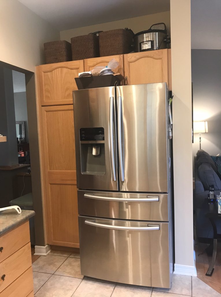
After several years of frustration with their kitchen layout, they were pretty open, willing, and ready to consider all available options to get the space right and a kitchen they could both enjoy working in together.
Once we reviewed their paint pain points and went over the list of ‘likes and don’t like’, we got to work on the floor plan.
DESIGNER DISCLOSURE: One of my pet peeves in kitchens, or any other space for that matter, is corner cabinets gratuitously added in a plan without any consideration to the placement of, and access to, surrounding cabinets or appliances. Have another look at the ‘before’ photo (below) of the corner cabinet next to the range. It is so narrow, and the range depth makes it difficult to reach into.

Can you imagine even trying to get into that thing?!!. I have a relatively small build, and the best I could do is to contort my left arm into blindly reaching into this cave to reach something…anything, while doing my best imitation of ‘Crouching Tiger’. (I know a lot of you have these in your kitchen and can relate….*sigh*)
The client essentially used this cabinet to shove ‘stuff’ in they didn’t use all that often, and then promptly forgot about it because it was such a hassle trying to get in and out.
That said, there are corner cabinets that are actually functional – when they are wide enough to provide access, and/or have an easy-access pullout accessory.
KITCHEN WINDOW SOLUTION
Of all the changes and improvements to this kitchen, one of the best design changes was addressing the two windows on the east wall. Both windows looked onto the neighbour’s house.
The breakfast area window looked onto a wall of siding (how inspiring), and the window over the sink looked directly into the neighbour’s kitchen.
The client told me they could actually have a conversation together while doing dishes. Great during a party but not so much first thing in the morning – hence the heavy shutters on the window.
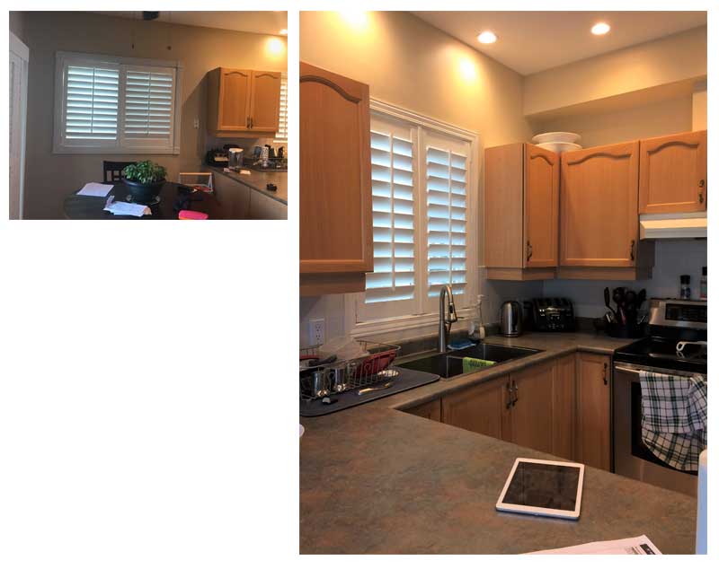
The window in the former breakfast area was taken out in favour of more counter space and much-needed storage. They have a large patio door adjacent to it.
We moved the sink window over to the left 18” to allow for a larger corner cabinet with better access.
Seeing all of the extra counter space, functional access to a once lost ‘cave’ and a SECOND pantry – yep a SECOND PANTRY!! – got the clients excited.
I know you’re in heaven reading this, right? A…SECOND…PANTRY…!!!
Remember all the bulk food storage they needed – BAM! There it is – the SECOND PANTRY….and who wouldn’t want that!
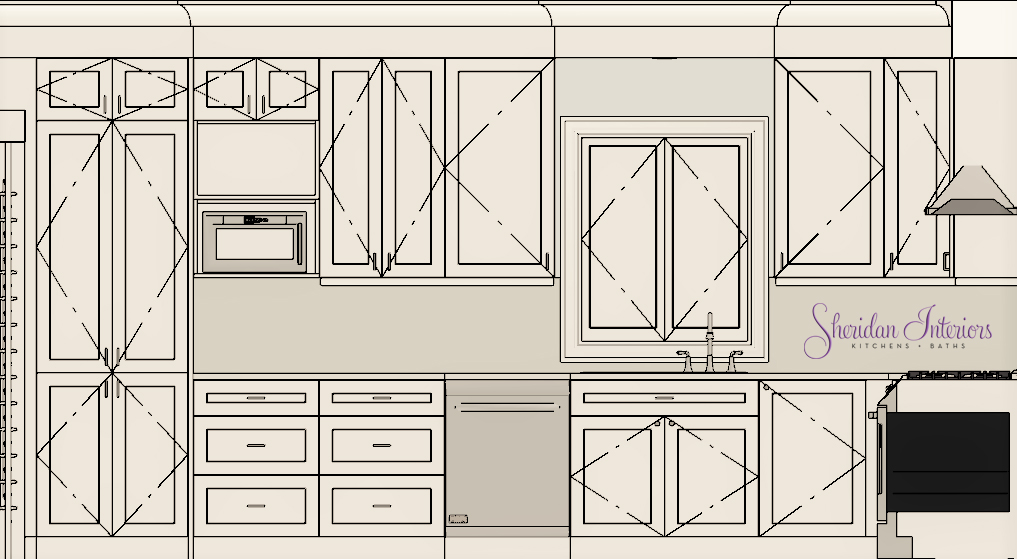
While we did not expand the existing footprint of the house, we were able to maximize every inch of what we did have to work with by adding extra functionality with interior cabinet accessories such as:
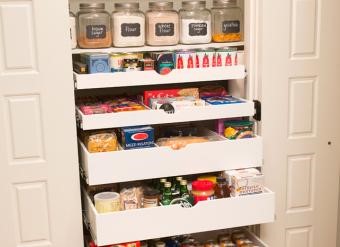
- Rollout Shelves in tall pantry cabinets for better storage access
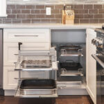
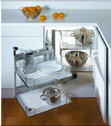
- a ‘Magic Corner’ base cabinet accessory for better storage access
- Added more drawer cabinets, less bending
- Fully accessible lower and upper cabinets with full extension drawers and glides
- AND and an island!
Now I’d say that’s a lot of BANG FOR YOUR BUCK!
Small kitchens require the right-sized appliances. Find out How to Choose the Right Fridge for your Small Kitchen
LIGHTING FOR A SMALL KITCHEN
To enhance this new layout, we updated the lighting plans as well. We relocated the pot lights and added new under-cabinet lighting, and functional and decorative lighting for the new island. All fixtures include energy-efficient LED bulbs. This kitchen now has:
- Task lighting (under-cabinet lighting) where you need it most, minimizing shadows
- General overall lighting, for overall illumination, and for easy and safe navigation
- Functional accent lighting with pendants at the island
FLOORING IN A SMALL KITCHEN
..and lastly, we updated the old tile floor with new hardwood flooring, and matched it to the existing wood flooring in the family room.
A new floor plan and design, new materials, and complementary colours truly bring this kitchen and family room together, making this part of the house a relaxing and inviting space to welcome friends and family.
SMALL KITCHEN RENOVATION UPGRADE LIST
WHAT THEY LOST
1. One window (I know you must think I’m a heretic…lol!)
2. Daily frustration of stepping over each other to make a meal
3. Not having a kitchen that works for their lifestyle
4. Dated kitchen
WHAT THEY GAINED:
1. Better kitchen layout for two cooks
2. A new, functional window over the sink
3. Privacy from the neighbour by relocating the window
4. A fully accessible base corner cabinet that they can actually use, just by moving the window over
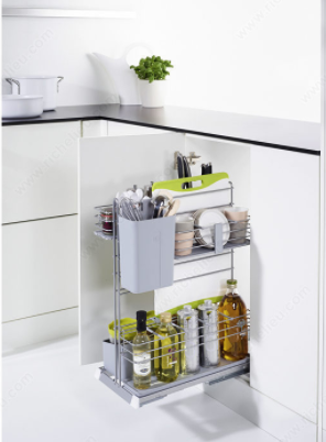
5. A pullout pantry for cooking oils near the range
6. Roll out shelves in the deep pantry by the refrigerator, and in the 2nd pantry.
7. Additional drawer cabinets throughout the kitchen and island.

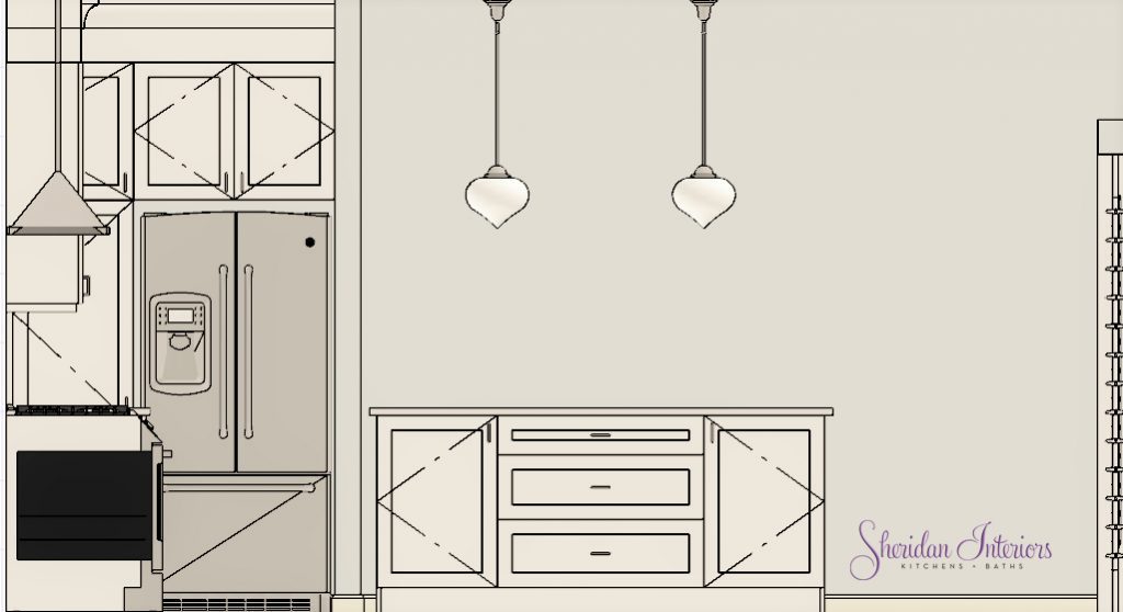
8. An island with seating for quick bites, and tall door cabinetry for storing large appliances and cookware
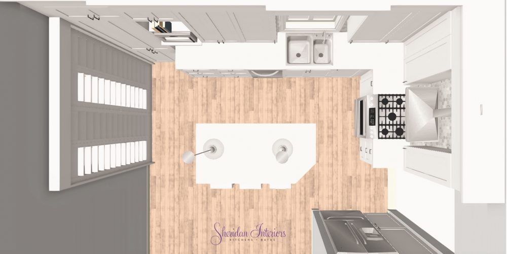
9. Lots of storage!
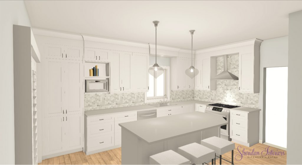
10. ….and a kitchen they love!
“We love the design and love our new kitchen”.
Andrea & Mitchell M. / Ottawa, Ont.
Now I’d say that’s a WIN-WIN!

Ready to turn your compact kitchen into a luxurious, highly functional space?
Book your FREE 30-minute Discovery Call with us and let’s chat about how Sheridan Interiors can help you maximize every inch of your home.

Select date and time:
Serving busy professionals in Ottawa, Orleans, Cornwall, and surrounding areas.
613-936-7237
info@sheridaninteriors.ca


