Anne-Marie Brunet, CMKBD, CAPS
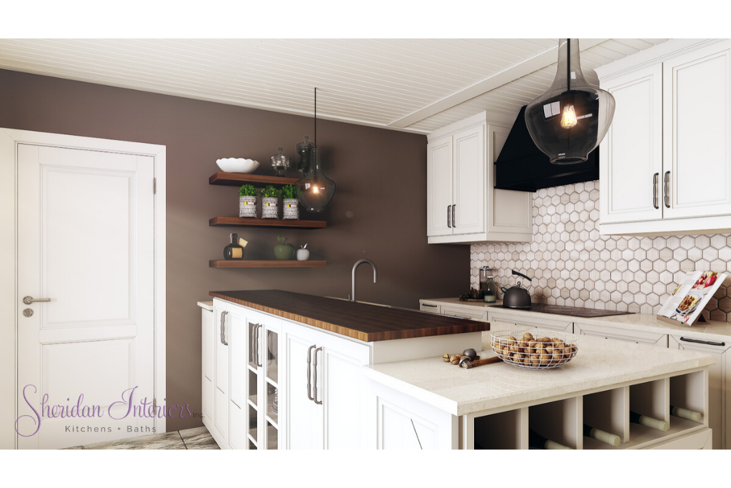
Get ready to taste a new recipe for a dated 70s kitchen, that whips it into the next century with lightened white cabinetry, rustic elements, and the added warmth of walnut.
I will start by saying that I have been fortunate to work with this couple on different areas of their home over several years. It’s a beautiful fieldstone home with the right amount of wood detailing on the exterior, in a pastoral rural setting.
When they called on me this time, it was to design their dated kitchen, which had been on the list for a long time.
So let’s dive into the BEFORE and AFTER story;
Here are some of the issues the clients were dealing with, along with some of the ‘Before’ pictures below;
- Not enough windows to take in the views of their nice backyard and fields beyond
- Not enough lighting; natural or otherwise
- Failing appliances
- Dark, dated all-wood kitchen
- Interrupted work zones
- Not set up for entertaining
- Not enough storage for everyday items
- Floor tile with too much grout – difficult to clean
1970s KITCHEN LAYOUT – BEFORE THE RENOVATION
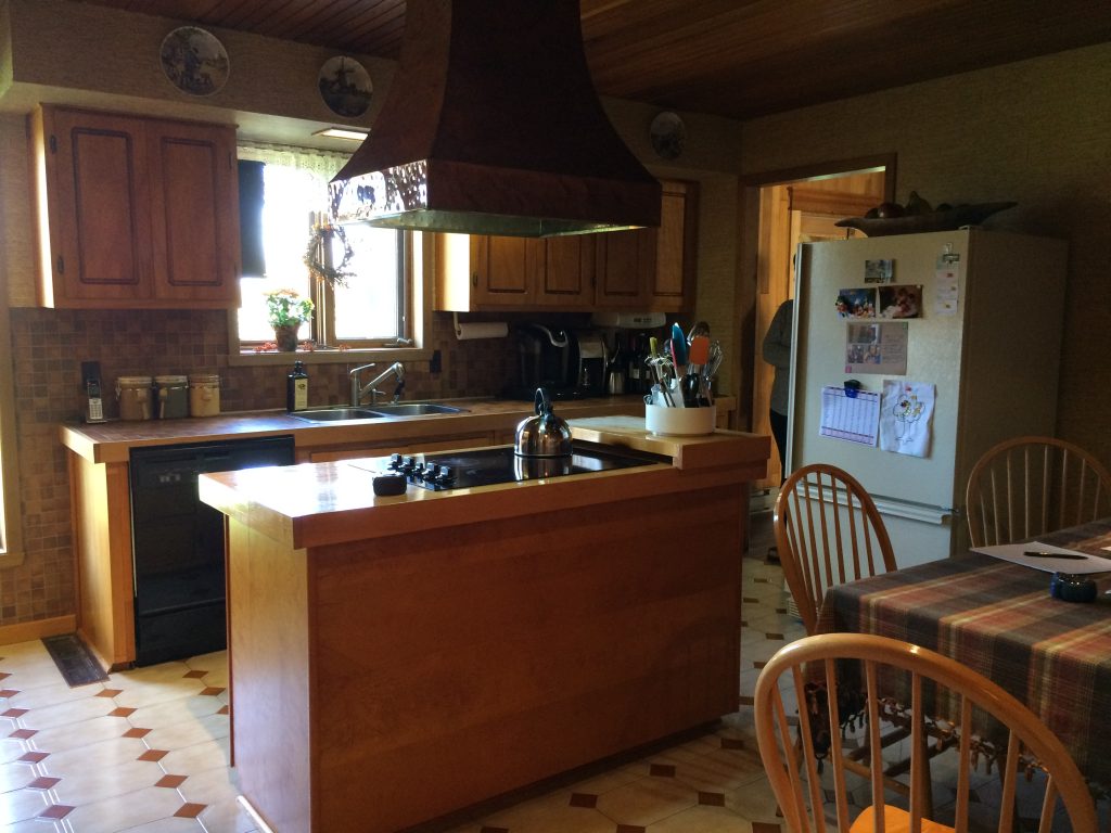
The original kitchen was dark, and as was typical of the day, there was no ‘built-in’ area for the refrigerator. So it was just hangin’ out there…by itself…against the wall.
There were the typical bulkheads over the cabinetry, which, in this case, only served as a stopping point for the upper cabinets. Since there were no obstructions, wiring, or HVAC in those bulkheads, I had some options for the new design.
I’m thinking that back in the day, this was probably a pretty au courant kitchen. It had an island with a hand-hammered copper hood over the cooktop…which was in an island – wowza!
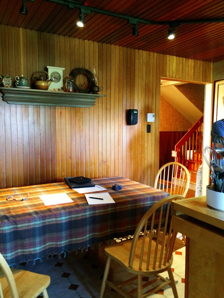
It also had a built-in banquette area for dining. As a little kid, I was fascinated by thes,e and who wouldn’t want a built-in seat – anywhere!!
1970s KITCHEN LIGHTING – BEFORE THE RENOVATION

The lighting was not adequate, and what was there had seen better days. There was no other lighting other than what would have been typical in the day;
– a small flush-mount fluorescent ceiling fixture over the kitchen sink (can you hear the hum?)
– the rangehood fan with a couple of small incandescent bulbs to light the whole of the island….and
that’s it
There was NO undercabinet lighting to light the counters – for much-needed task lighting
The one ceiling fixture had been replaced with track lighting (hello 70’s!) to try and generate general lighting near the work surfaces and for the room in general. The bulb technology at the time was MR16 bulbs, which were notorious for burning out prematurely. (notice the 3 burnt out ones in the photo below)
These photos were taken during the day, and you can see and feel how dark the room is.
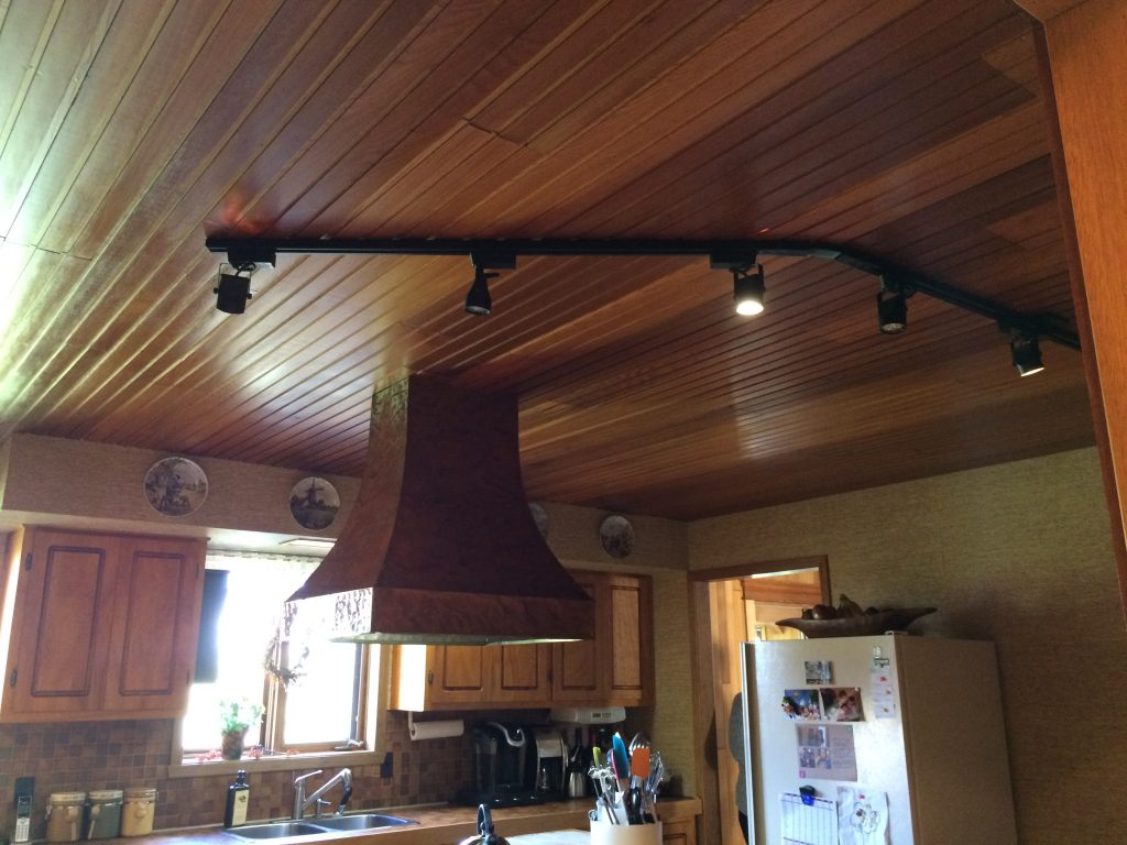
With wood cabinets, a wood ceiling, and bench-style banquette panelling all stained in a medium-dark stain, these elements together further reduced the amount of light bouncing around in the room by absorbing any and all natural or mechanical light.
While those elements added to the space feeling really cozy, they did nothing to alleviate the serious lighting issues the clients were dealing with.
I had to admit, though, the wood ceiling was beautiful, well-installed, AND in great condition.
Note to self 😉
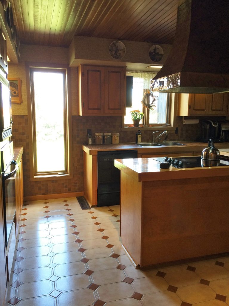
The kitchen windows look out onto a nice view of the yard and the fields beyond, which can only be enjoyed while at the sink. The kitchen faces north, with not a lot of natural light pouring in from the window above the sink. The best natural light they get is from this tall window.
While this kitchen served them well over the years, raising a family and making many holiday meals etc., as needs and lifestyles change and evolve, they were ready for an upgrade.
So here’s their Wish List;
- Opening up the kitchen to the views in the backyard and fields.
- Getting in more natural light
- Better overall lighting plan
- New appliances
- A dedicated baking space
- A layout that would better accommodate entertaining and buffet-style serving
- Improved storage and cooking zones
- A place for two to grab a quick bite
- A ‘new’ look… but in keeping with the traditional style of the house
NEW KITCHEN LAYOUT FOR A 1970s HOME
After coming up with several kitchen layout options, the clients liked this one the best, AND it checked off ALL the boxes on their WISH LIST – Yay team ♥ !
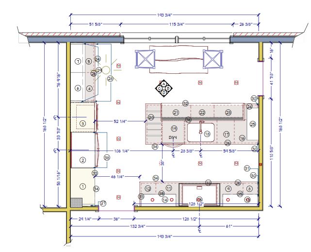
HOW WE ACHIEVED THEIR KITCHEN DESIGN WISH LIST
- Opening up the view to the backyard with a larger casement window – this design element was paramount to the overall success of this renovation
- The larger window lets in a ton more natural daylight into the kitchen.
- The larger window was the perfect spot to put a small table for two, so they could finally enjoy their view!
- The Peninsula was a great way to incorporate the serving space she wanted for buffet-style entertaining. It also eliminated traffic through her work zone.
- The elevated portion of the peninsula hides the sink behind it and serves as the serving centre when they entertain buffet style. The flow of this works much better now as guests enter from one side and leave from the other. .
- The raised portion with glass-fronted cabinets on the dining side also serves as a display case for her nicer dishes and creates a ‘hutch’ effect.
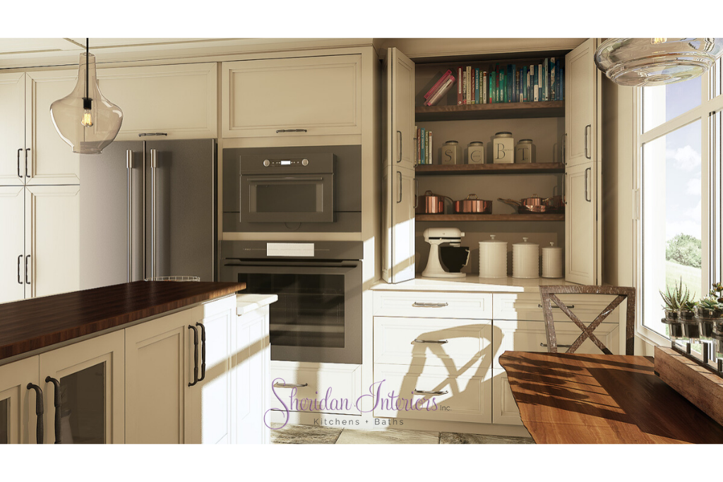
- The new counter-depth refrigerator was moved to the opposite wall and is now built-in to the surrounding cabinetry
- The wall ovens were updated
- Created a dedicated backing space with everything she needs in one place
- The new and improved lighting plan added so much more light exactly where it was needed, as well as increased much-needed general lighting throughout the new kitchen
- I re-used the wood on the ceiling in a classic traditional way – which pleased the Mr. – he loves his wood! See Ceiling info below
- I selected new materials and colours that satisfy her request for a lighter look, and natural rustic elements to tie in and blend with the house’s original character.
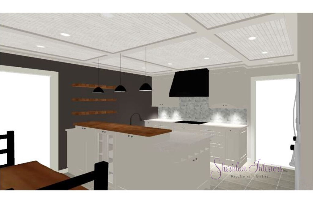
WOOD CEILING DETAIL FOR A COUNTRY KITCHEN
In the 3D view above, you can see we repurposed the wood slats for the new ceiling plan.
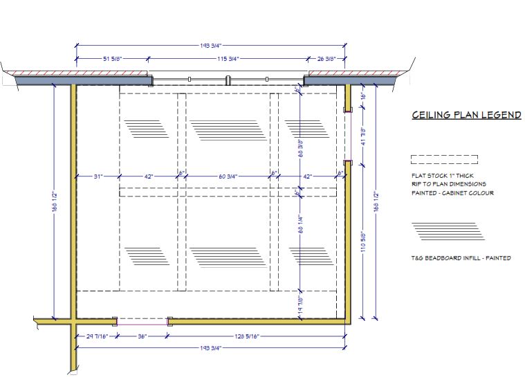
All of the old wood slats were removed from the ceiling so we could run new electrical and HVAC rough-ins. Once the bulk of the reno was completed, the wood slats were meticulously sanded and reinstalled according to the ceiling detail plan below.
While I really wanted to do a true coffered ceiling detail with beams, the ceiling height would not accommodate the beam thickness. Instead, I ‘cheated’ the look using flat stock to create a similar idea of a coffered ceiling.
It was a bit of a challenge getting the grid layout just right to line up with cabinetry, appliances, and windows, and maintain some symmetry, but we did it!
That ceiling design was enough to add that extra detail to the ‘fifth wall’. The clients loved the idea immediately when I presented it, and they are loving it now – perfect!
Painting it the same colour as the cabinetry lightened up the room considerably.
KITCHEN CABINETRY DETAILS FOR A 1970s RENOVATION
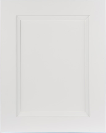
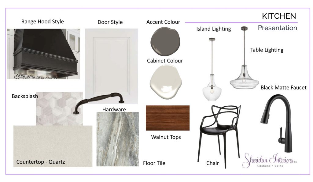
The clients agreed they really didn’t want any more wood cabinetry in the kitchen and really wanted to lighten up the space. I specified a painted, modified Shaker door in a soft white colour.
It’s called a modified Shaker door because it has a bevelled moulding at the inside edge. I chose this style because I felt it would cross the divide; it was both transitional (to check off the ‘new’ request) yet traditional (Shaker) and blended well with the home’s country yet traditional character.
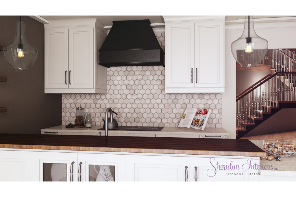
To get away from a ‘sea of white’, which can sometimes feel too sterile, I added a custom-made cabinetry rangehood in black. The black range hood gives the kitchen an updated, sophisticated look while complementing other black iron pieces in the great room next to it.
I mean, a little black always looks right in any room!
HOW WE UPDATED THE LIGHTING IN A 1970s KITCHEN REMODEL
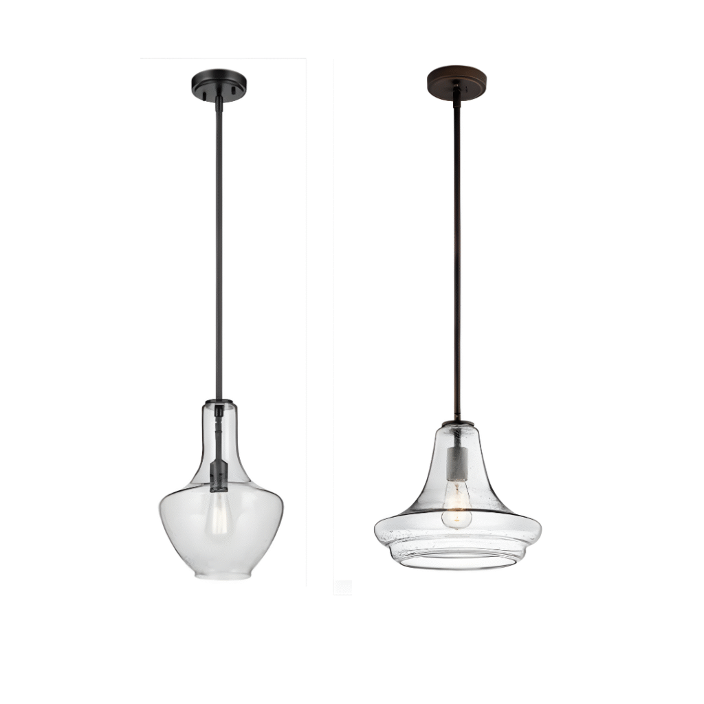
In designing the lighting plan, I paid special attention to the lighting type for the peninsula. I like it when pendants make a statement in a room, but in this case, they also had to be ‘invisible’ to maintain the unobstructed view from the new large window to the backyard.
The other consideration is that both clients are taller than I (who isn’t, haha), and I needed to balance the length of the pendants to the clients’ heights, and balance the proportion and scale of the fixtures for the height of the ceiling.
Lighting for the dinette table was also considered for size, scale, and height.
The solution was these glass see-through pendants. I chose two fixtures in complementary styles, since they would be relatively close to one another, and I didn’t want the lighting to be matchy-matchy.
NEW KITCHEN FINISH SELECTIONS FOR 1970’S KITCHEN RENOVATION
CABINET HARDWARE COLOUR
While the hardware selected is labelled as Oil Rubbed Bronze, it more closely resembles a black colour, which I wanted to complement the black range hood.
FIXTURES AND FITTINGS FINISHES
A black matte faucet and accessories, to contrast with the white cabinetry and black metal finish on the light pendants.
While Matte Black can feel more contemporary in certain designs, here it fits in perfectly with the rustic iron materials throughout the home.
See how we increased storage and function in this small kitchen without increasing the footprint
PAINT COLOURS FOR A 1970s KITCHEN REMODEL
I selected a darker colour for one wall of the kitchen to make the cabinetry pop and inject some rustic warmth. I chose a colour that would complement the walnut slabs and floating shelves.
The ceiling and the rest of the walls were painted the same colour as the kitchen cabinetry, a soft off-white colour.
FLOORING SELECTION FOR A 1970s KITCHEN REMODEL
We all fell in love with this large, rustic, stone-looking porcelain tile. This colour and pattern would prove very forgiving and easy to keep clean for a family that loves to entertain.
COUNTERTOP SELECTIONS FOR AN UPDATED 1970s KITCHEN RENOVATION
COUNTERTOP
I selected a light-coloured quartz for the countertops to complement the light coloured cabinetry. The peninsula and table top were treated to beautiful, rich walnut slabs for warmth and rustic texture.
BACKSPLASH
I selected a small hexagon tile in marble with some colour variegation for the backsplash. Hex patterns have been around since the 1920s, and this pattern checked off the ‘new’ box for its new material type, but also checked off the ‘traditional’ box for the traditional county aesthetic of the home.
NEW KITCHEN REVEAL – Warm and Rustic Charm for a Traditional Country Home.

Your attention to detail and open communication with us was so appreciated!
Debra and André P./Summerstown, Ont.
IS YOUR HOME STILL STUCK IN THE ’70s?
If you like what you see here and are ready for your makeover magic, go ahead and schedule a Discovery Call below. Let’s talk about the possibilities for your space.
Serving busy professionals in Cornwall, Ottawa, and surrounding areas.


